RBC MyAdvisor
A digital service that makes managing finances simple & easy.
The Brief
Reimagine the traditional financial advisor to client relationship via a new digital solution.
Make financial planning less of a chore and more of a pleasure.
The Problem
CRM2 will introduce fee transparency into the Canadian market in 2016.
Some existing customers may be at-risk as they may not see enough perceived value from current fees.
Difficult for RBC to scale up existing branch advice model due to financial planner capacity constraints.
Ethnographic research suggests clients highly value comfort that a financial planner provides and willing to pay for a trusted advisor.
Painpoints
Many Canadians struggle to plan for the future. The research conducted reveals clear pain points in the market.
Themes and Quotes
It's hard to plan for the future
I feel overwhelmed by the process of managing my finances
I want a trusted advisor—not a robot
I want meaningful advice and expertise

Opportunities
Provide Personalized Financial Advice
Connect People with Trusted Advisors
Help Clients Achieve Their Goals
Product Design
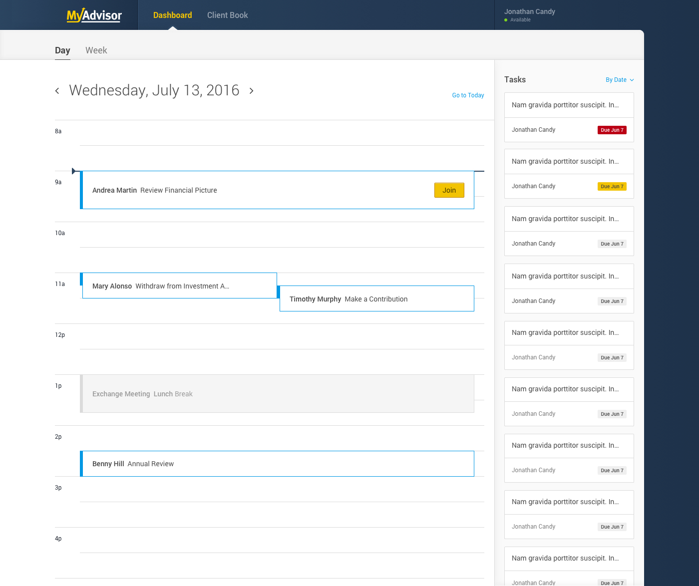
A client-facing dashboard and an internal advisor dashboard were created as part of the MyAdvisor product.
This section highlights some product design processes
UX
As with any product creation, UX is always one of the first steps. During the first couple months, my team focused primarily on mapping out different solutions on how MyAdvisor would work and tested every detail along the way. In the end I believe we created a pretty compelling product idea that took financial planning (on a website) to the next level.
The Focus
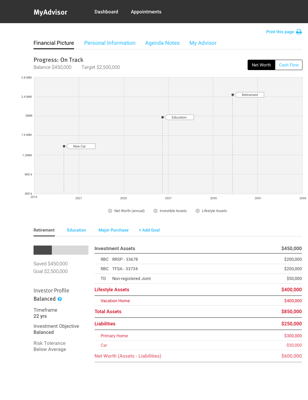
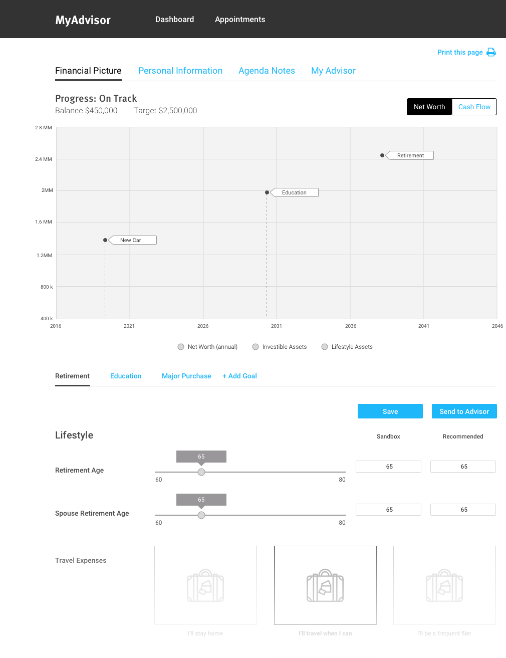
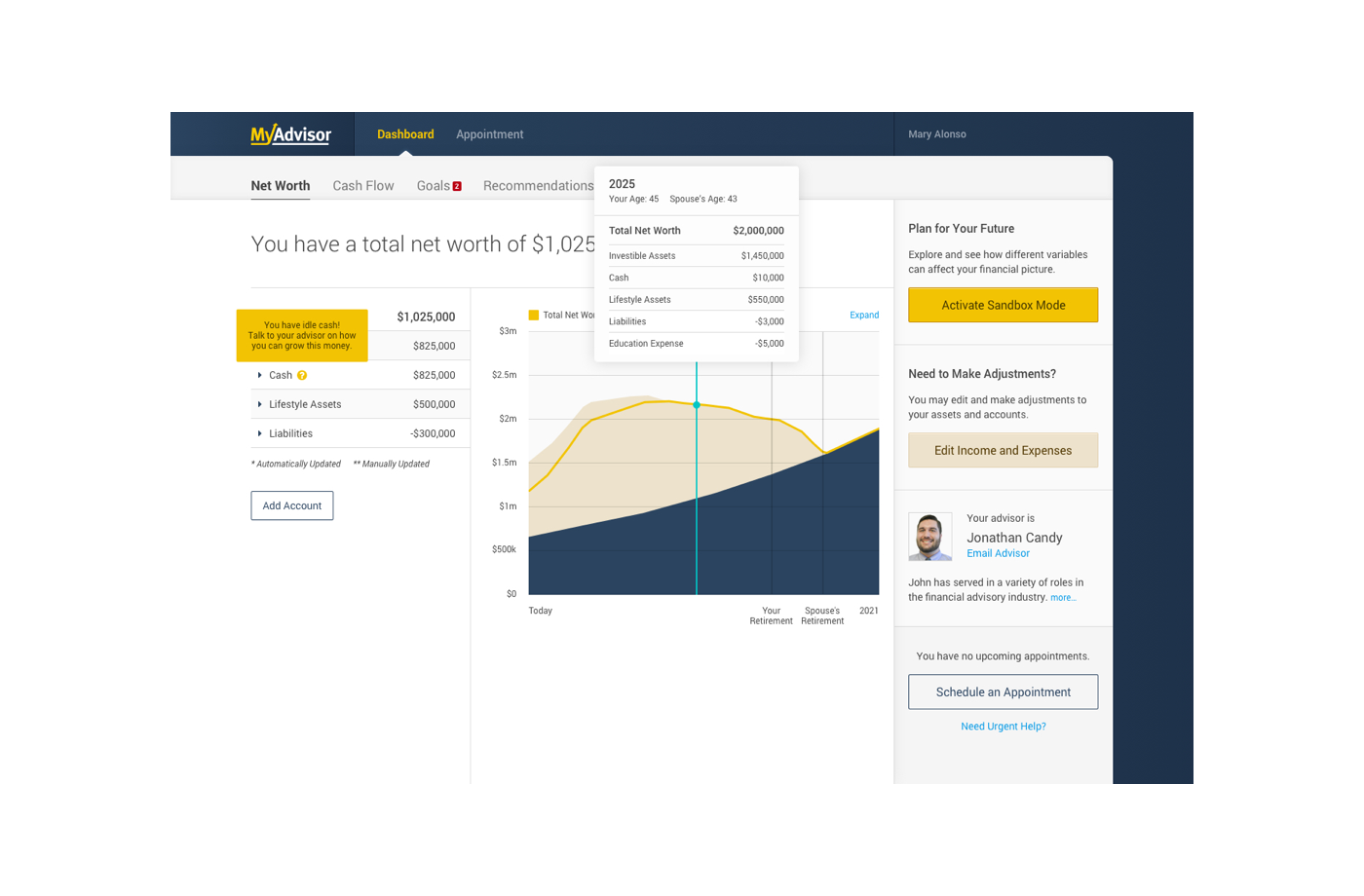
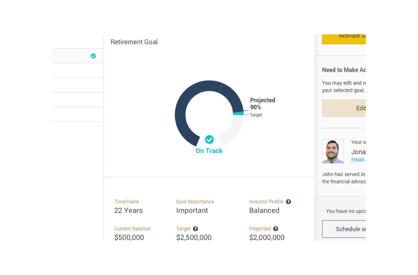
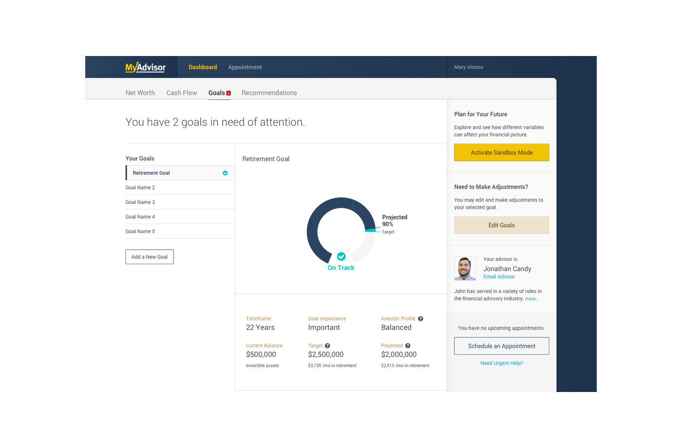
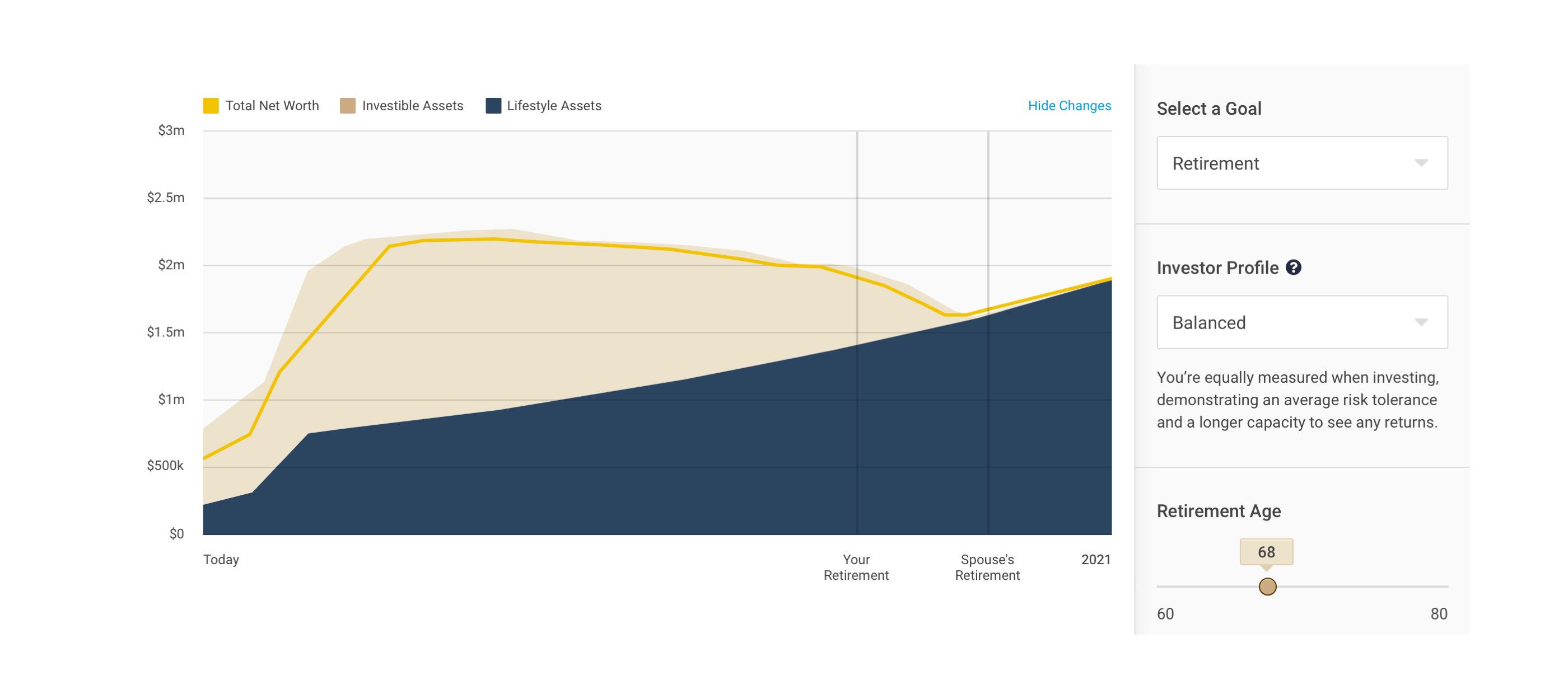
A client's financial picture is the most important piece of information when it comes to financial planning. It is the view that shows everything from assets to networth to projections. Because of that, we dedicated our brain power here to try and come up with something new.
Low Hanging Fruit
From a usability standpoint, the obvious thing to do here is to create an interface that is both easy to understand and use. Through my research, I noticed that a lot of existing financial dashboards uneasy to use and in some instances even intimidating.
The most important finding however, is that a lot of visual representations (whether it be graphs or tables) were straight up not helpful at all. So I took it upon myself to also design a graph that would be easy to understand.
Some early days design explorations of the financial picture module
Testing It
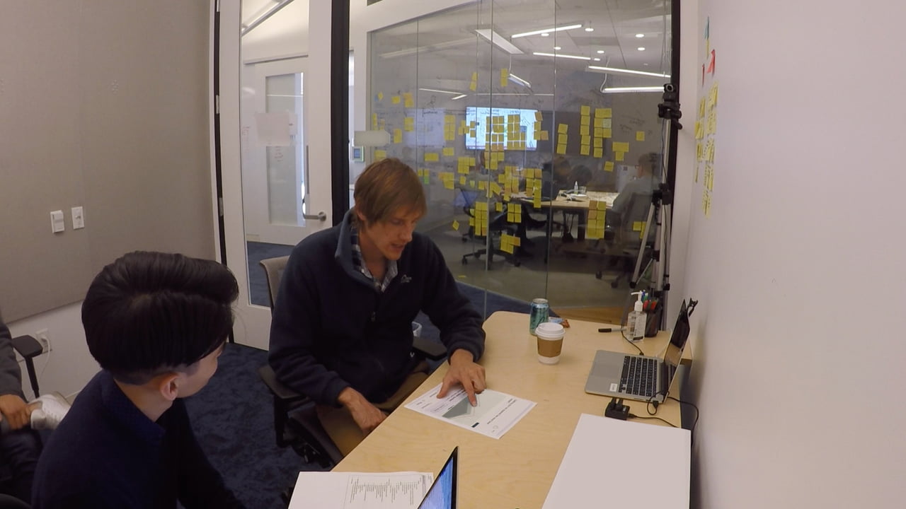
I ran multiple rounds of tests to nail down the best direction for the financial picture module. Using paper protoypes, I was able to quickly create different combinations of layout, styling, as well as information fidelity for the tests. It is also important to note that I tested existing RBC clients who would ultimately be the end users.
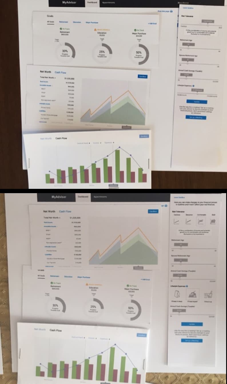
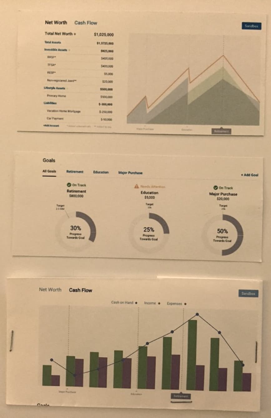
Examples of the paper prototypes used for our tests
Some Key Findings
By the time when I concluded the last round of tests I had almost every client express positive feedback. With one particularly saying: “This is really great. I haven’t seen anything like this before. Especially being able to see a full picture. When is this coming out?”.
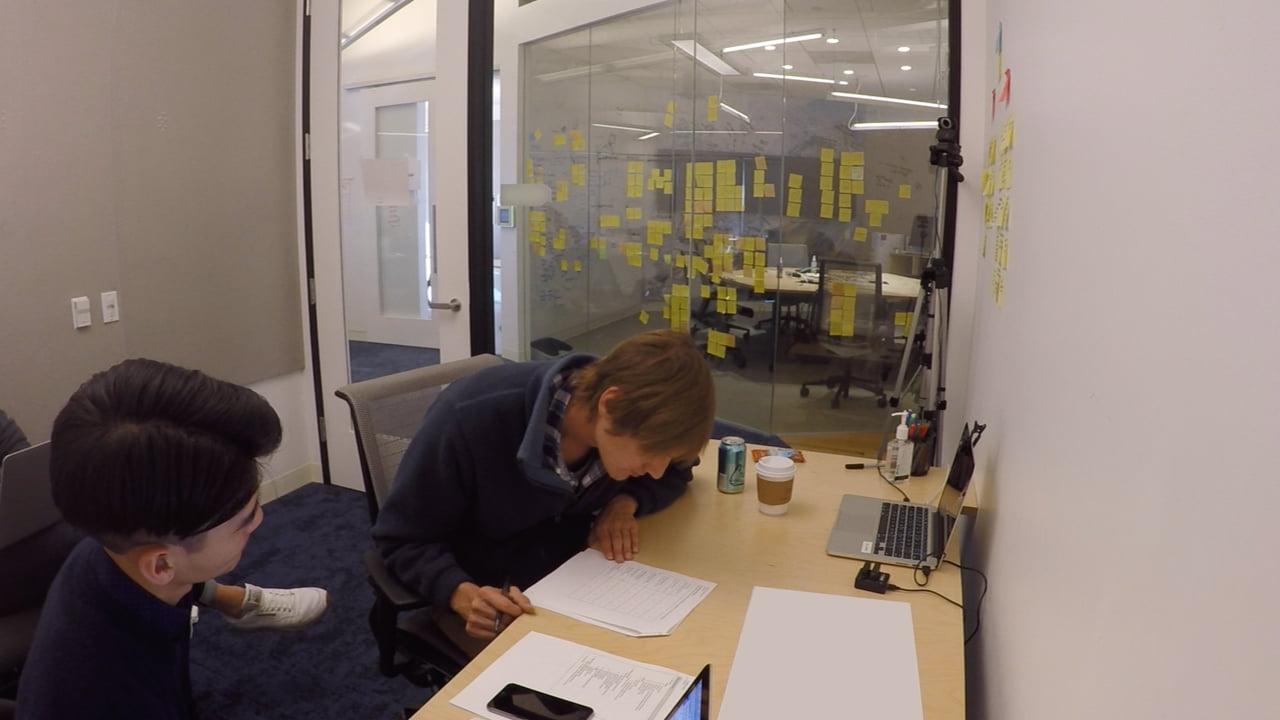
Snapshots of a test session
The Big Idea
Simply having a dashboard that is easy to use and understand is nothing more than an UI improvement. The product was still missing the killer feature.
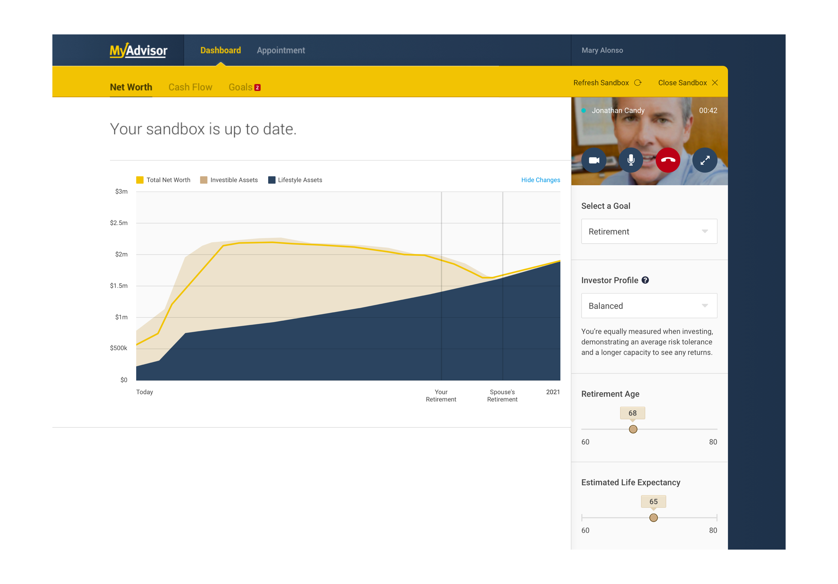
I knew from the beginning that we needed to build in a way for clients to talk to their advisors live on the platform, as that was the whole basis of this project in the first place, so that cannot be the big idea, nor should it be (video conference is a common thing nowadays).
The inspiration came during one of my team calls. I was reviewing some designs and trying to give feedback over the call, but started having trouble because some of my comments got a little complex and required more than words. Naturally, I took over screen share and started explaining by showing it on screen. The other designer and I had to constantly switch between screen share to work out the designs, and thats when I realized what a pain swapping screenshare is!
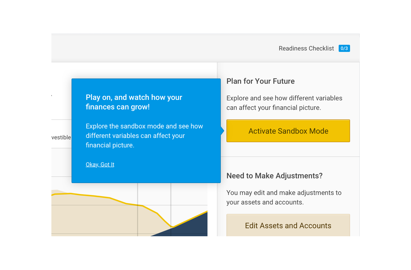
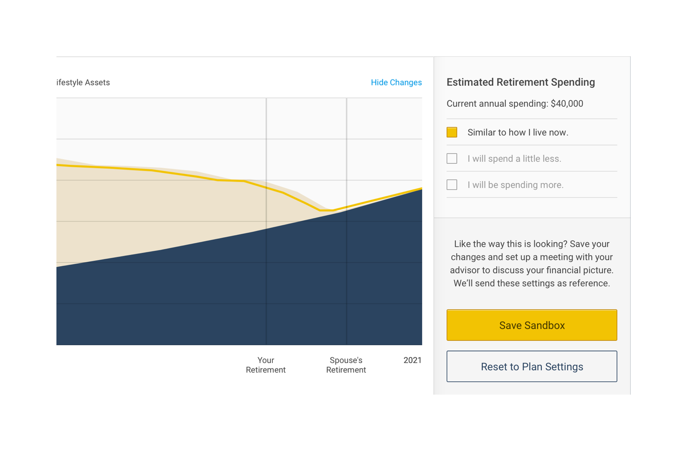
When someone on the call said "I wish you guys could just both edit it at the same time, it would save so much time" was when the inspiration truly arrived. How wonderful would it be if both the Client and Advisor can talk and edit the financial picture together (at the same time like google docs)? It would eliminate the last hurdle betweeen a physical and a virtual meeting.
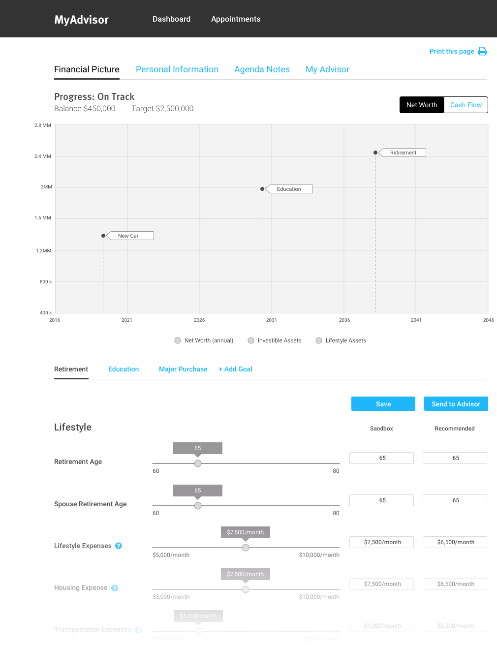
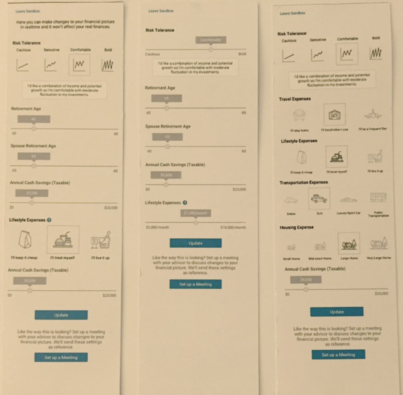
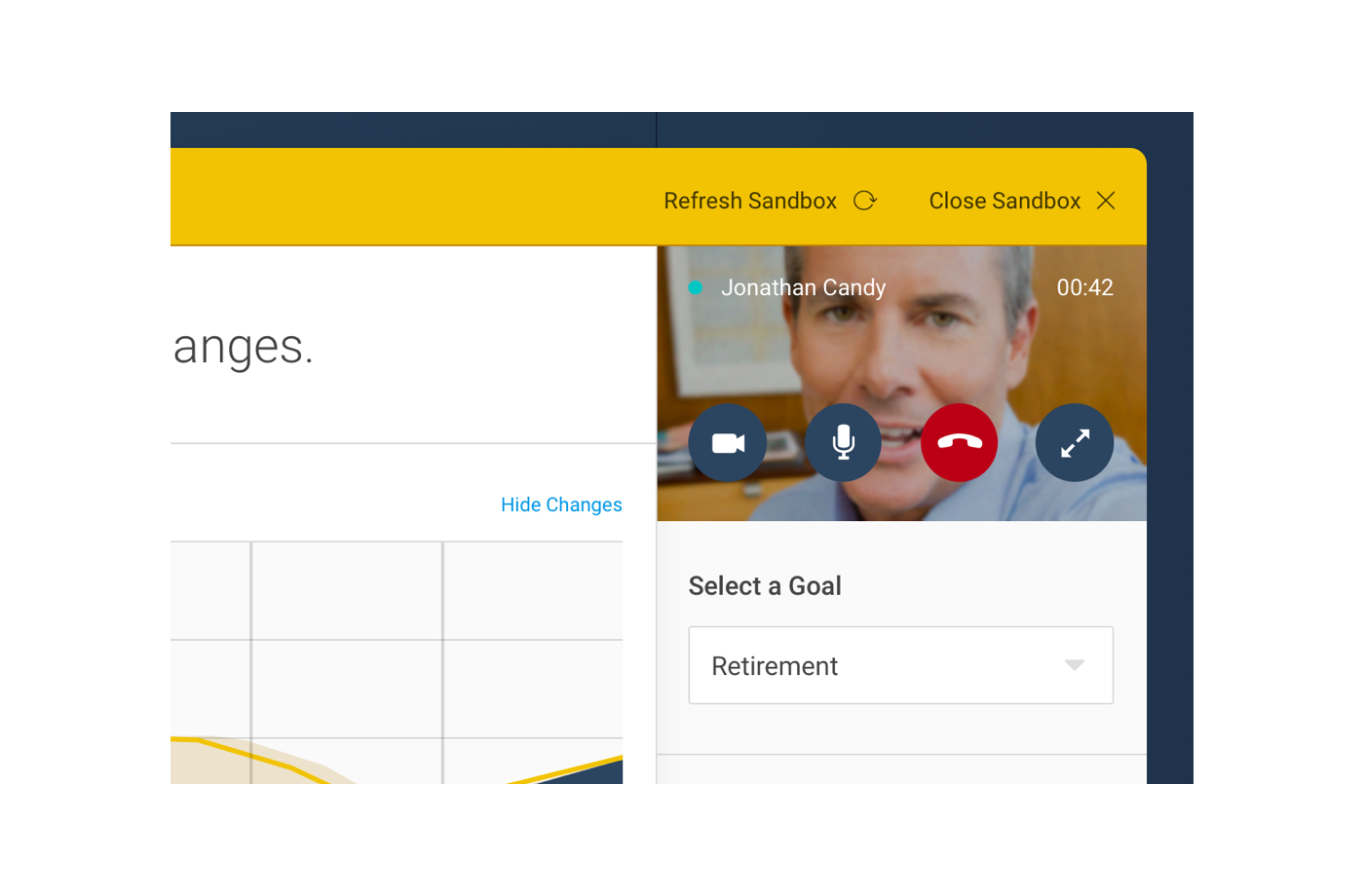
We called this feature the 'Sandbox'.
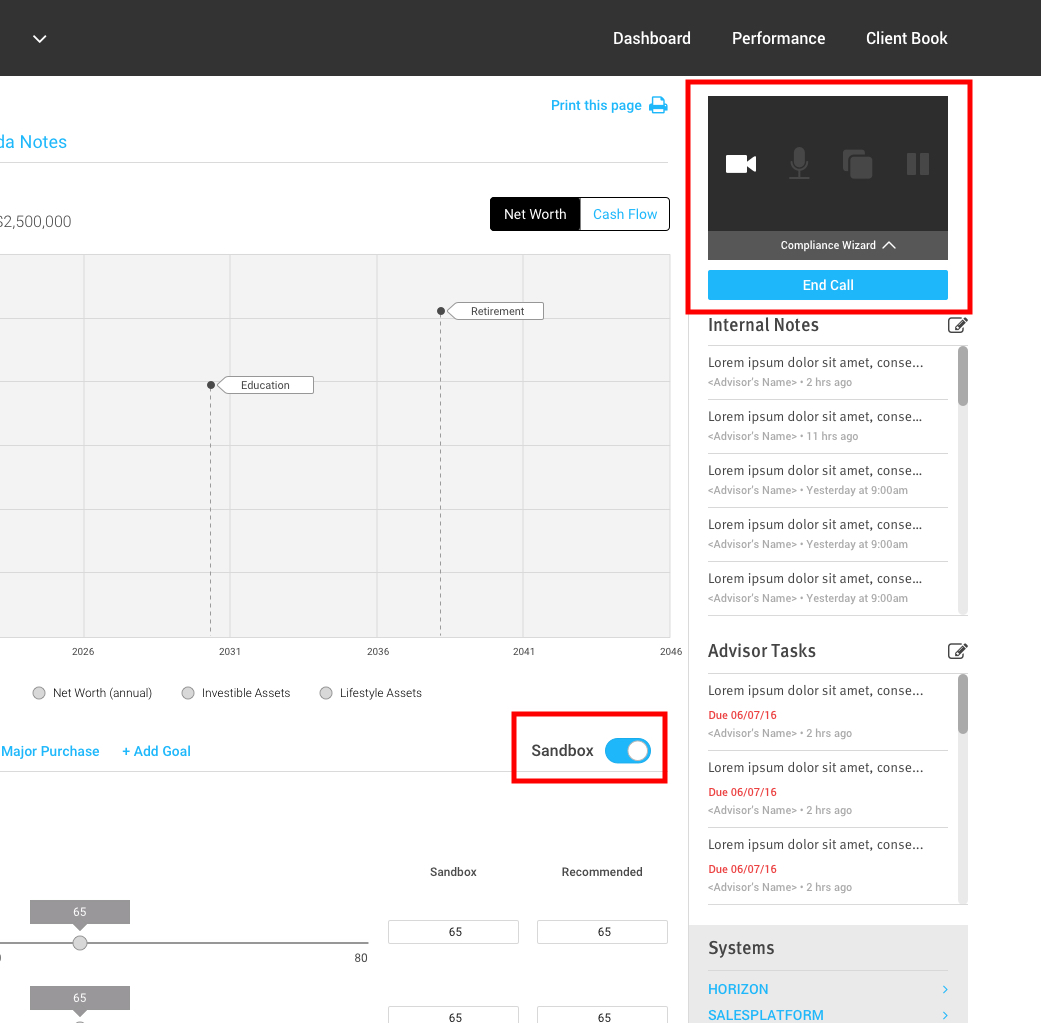
Wireframe showing the idea of Sandbox
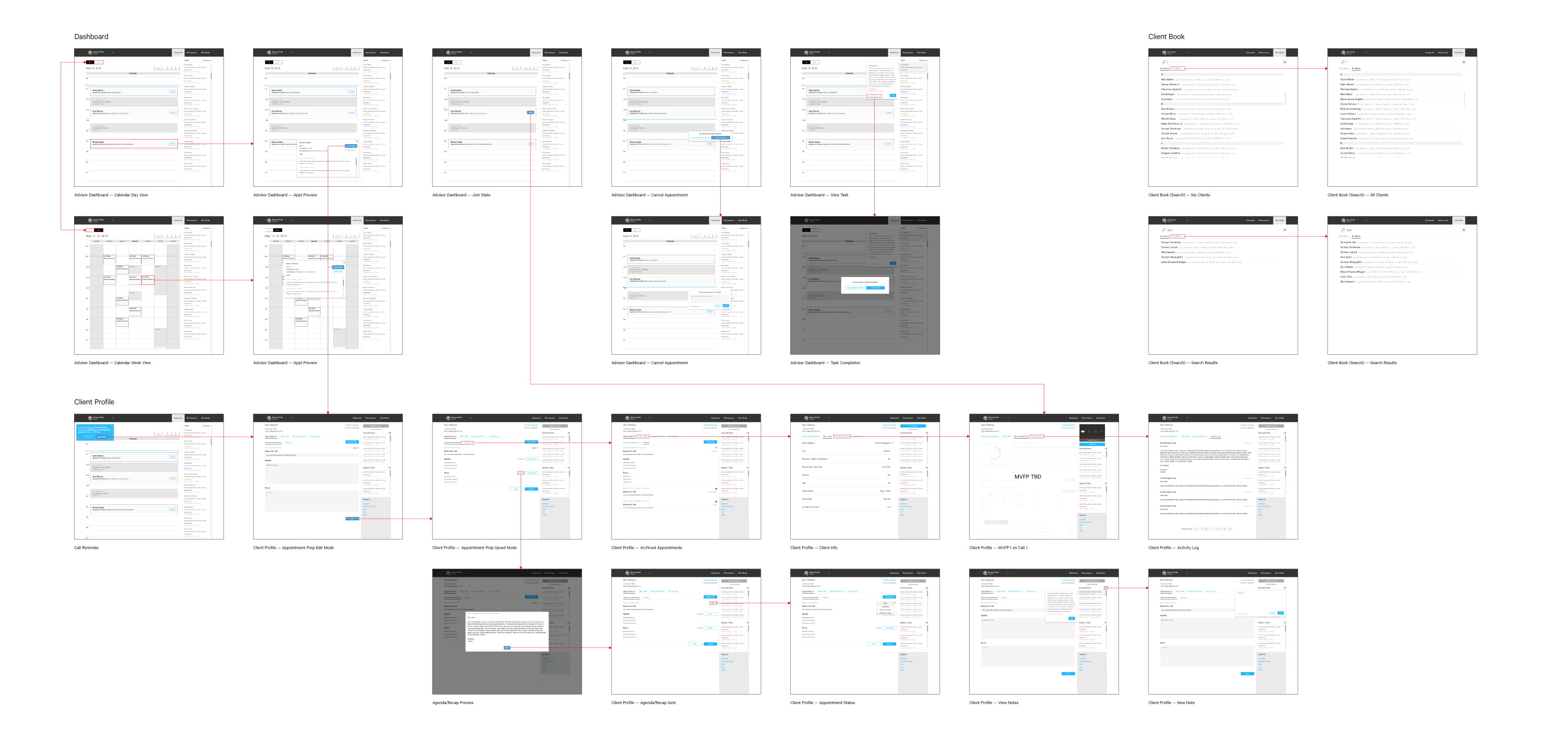
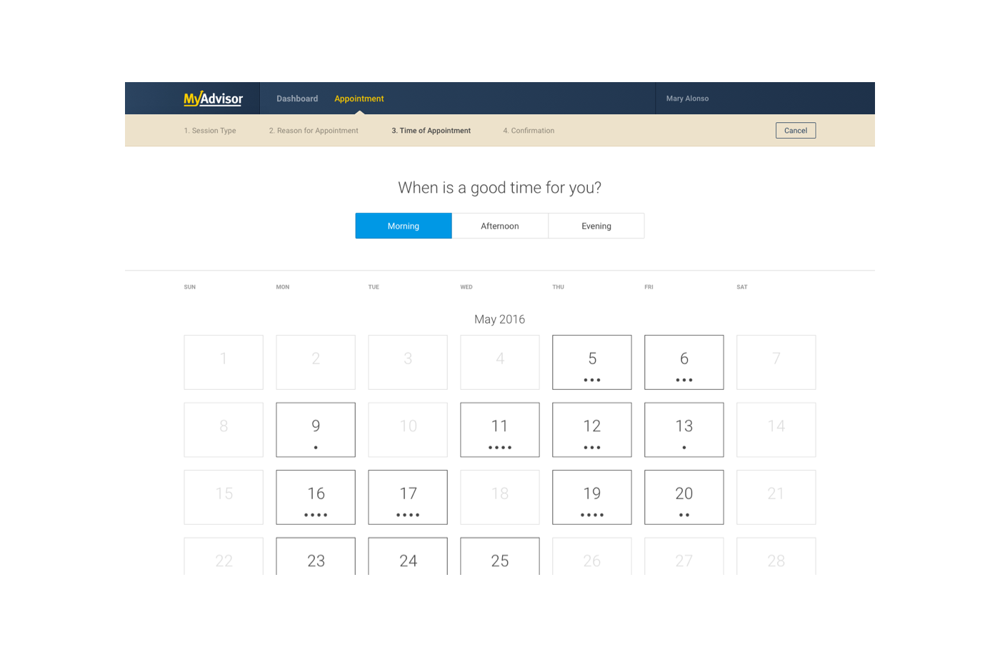
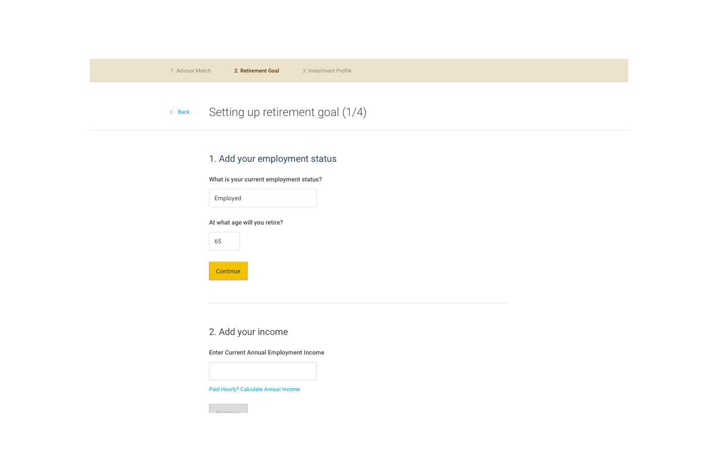
User Flow
I flushed out wireframes for the whole product and created user flows to show primary use cases. These were printed out as large formats and posted up on walls.
One portion of the Advisor user flow
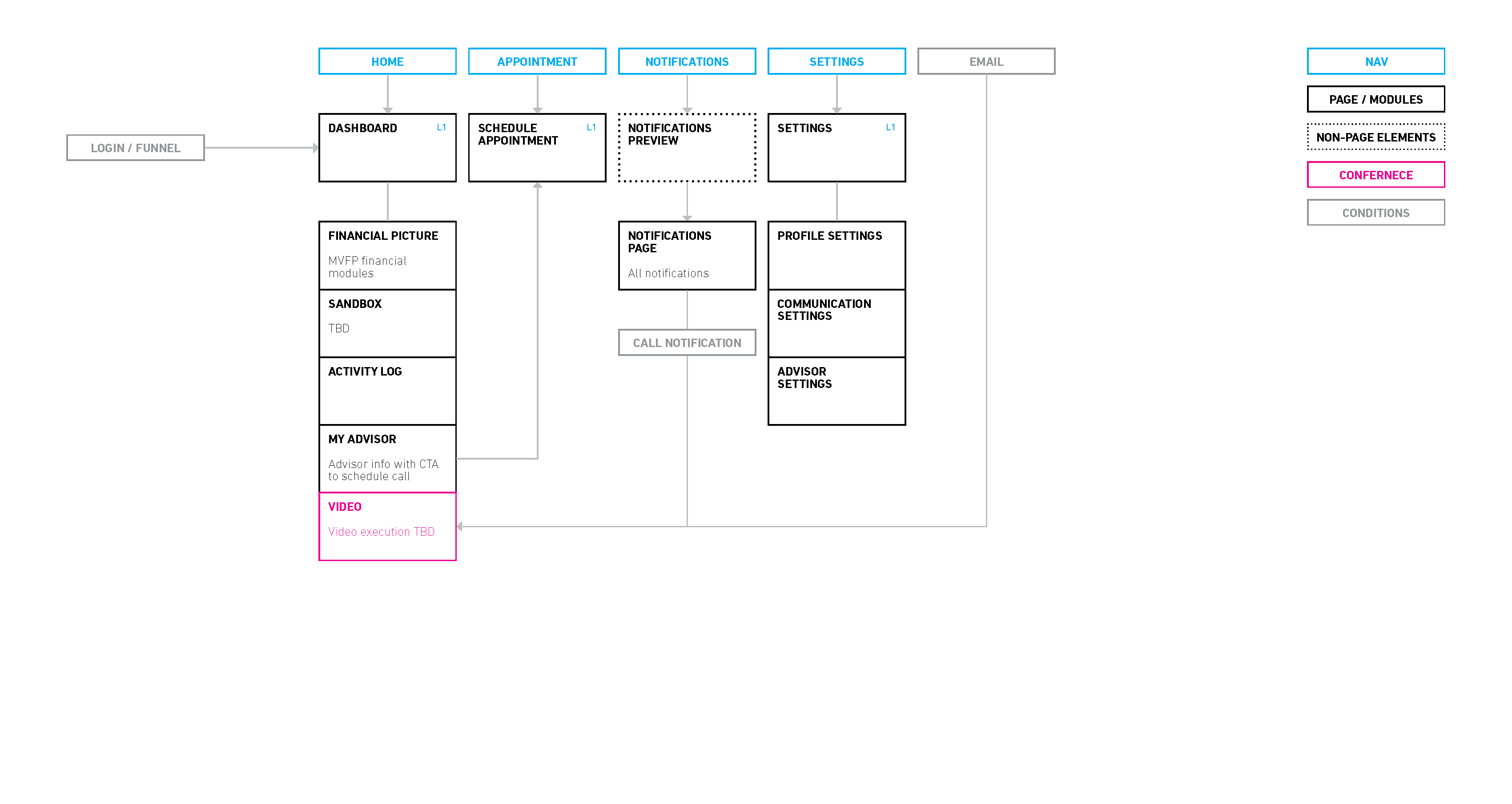
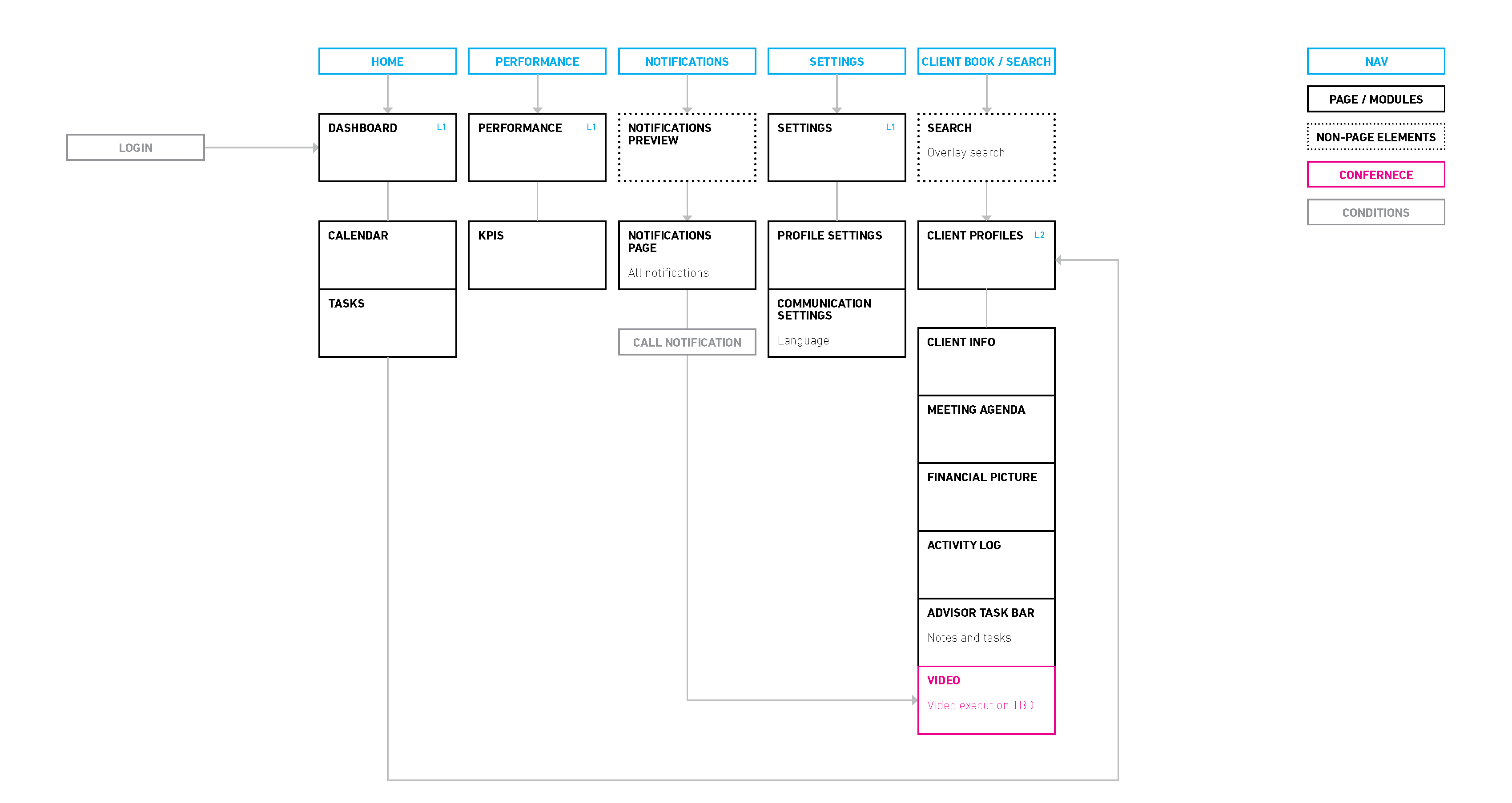
Information Architecture
The final part before moving into UI design is to map out the IA of the client and advisor dashboards. This helps everyone in the team visualize how the whole thing comes together.
UI
Now that we pretty much have the product experience nailed down. I shifted my attention and worked closely with product managers to help prioritize features and planned out sprints. With the product roadmap looking good, the next thing is finally to bring it to life!
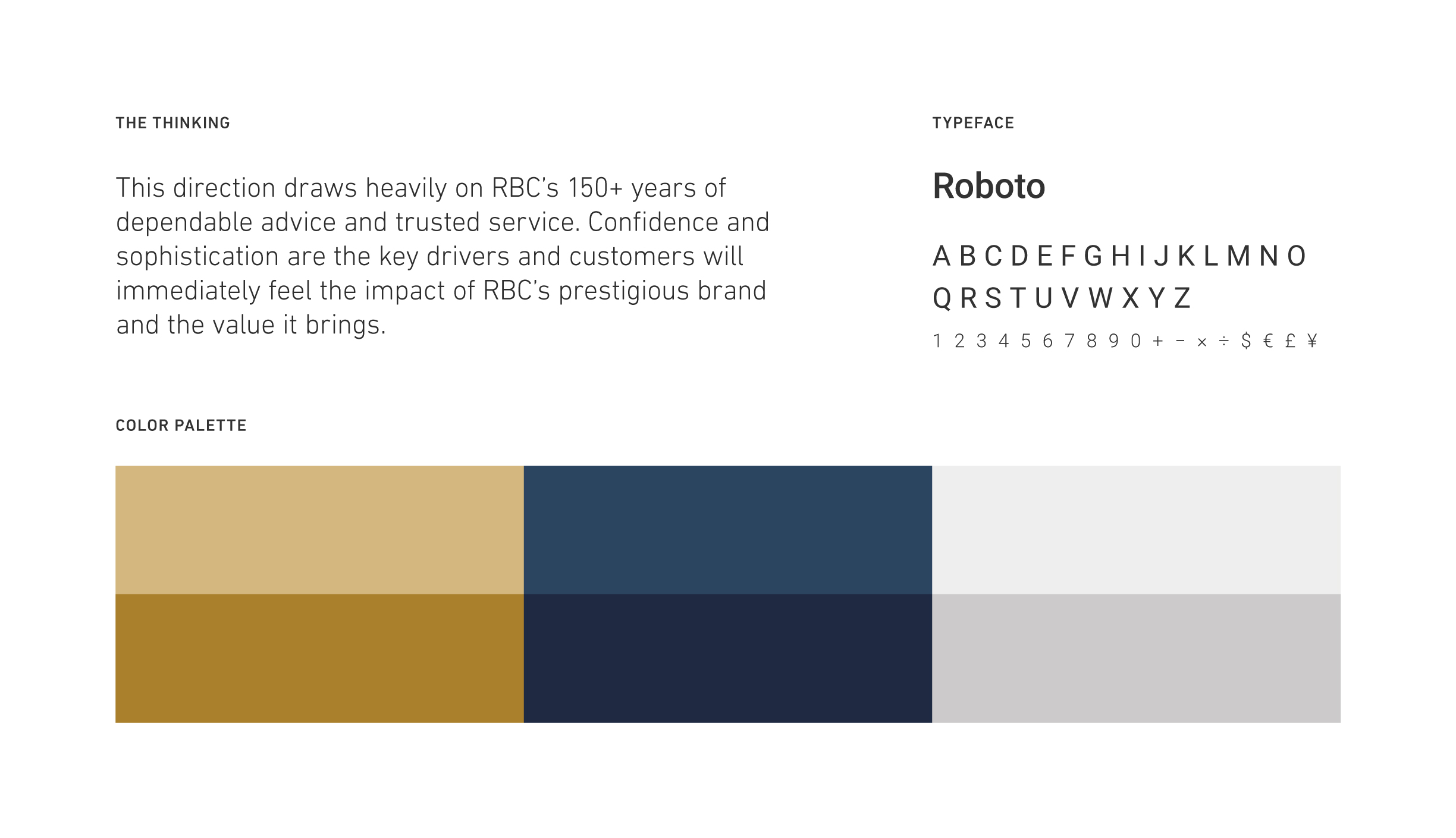
Design Direction
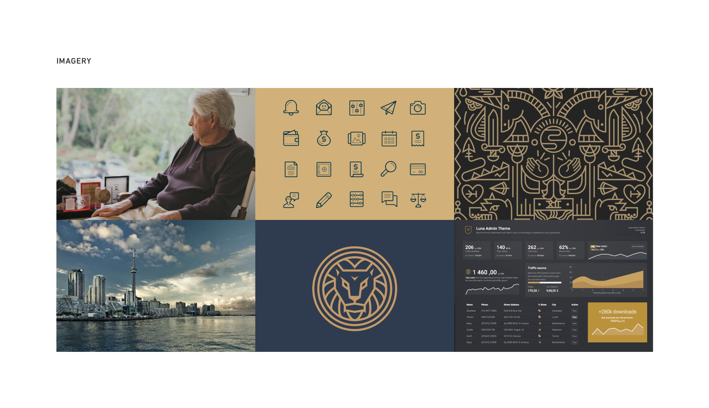
The first step before any UI can be created is to establish the style and design direction. At this stage of product development, I prefer to come up with a light style kit vs going all out on design system and styleguide. This process involves some research, moodboards, and ultimately coming up with a style kit of the 3 most critical elements: color, type, and imagery.

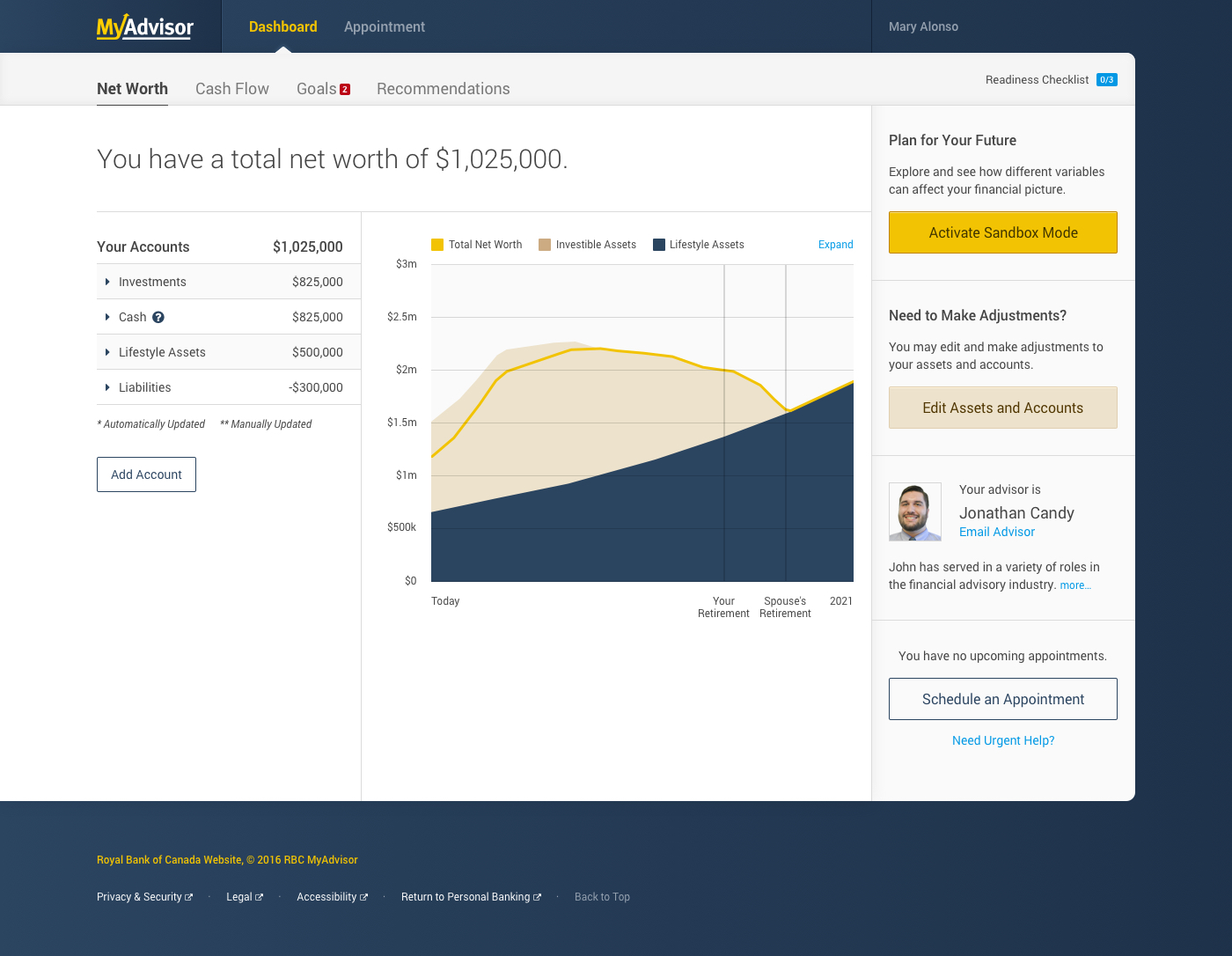
Dashboard UI
Brand Design
MyAdvisor is a sub-brand within the RBC ecosystem, which means there are certain brand standards that we must adhere to.
Like adding in the yellow!
Logo
The logo had a requirement (from RBC) that it must be a wordmark. In addition, it must also work in the RBC Shield lockup as a business descriptor (shown in picture).
The Rationale
All financial investment services have one thing in common, its customers all want positive return. The most universally recognized metaphor for good investment is the up arrorw. Using that as inspiration and keeping within the limits of RBC's brand requirements, I created a logo that could live on its own or with the RBC brand, while still maintaining its personality.
Want to See More?
A lot more work has been put into this including style guide, design system, marketing collateral, and more.
Don't hesitate to reach out if you want to see more