LEGO Shop
The global LEGO Shop (e-commerce) redesign.
The Brief
Redesign the e-commerce experience to help drive brand recognition and ultimately revenue.
Translate the brand's uplifting identity into an online experience that compels users to browse and shop.
The Goals
Inclusive of all key D2C shopper personas.
Greater source of engagement and opportunity to tell brand story.
Driver of traffic and time spent on LEGO web properties.
Platform for future growth and global preesence.
Encourage conversion, generate revenue, and foster stronger D2C touchpoints.
Background Info
This project all started because LEGO was undergoing a company initative called the Digital Brick. The strategy behind it was to elevate LEGO's brand presence online as it had fallen behind due to their focus (in the years prior) on retail and product offering. This e-commerce redesign was the initiative's first step and it was a massive undertaking because the release was targeted for all regions worldwide.
During my time on this project, I visited many different LEGO offices around the world including Enfield, London, Billund, and Munich and got to work with a lot of passionate people at LEGO.
Shopper Personas

Busy Dad
Knows what to get and wants to make the purchase quick with minimal browsing

VIP Mom
Price sensitive and does a lot of research. Big on LEGO's reward system (VIP).

Clueless Relative
Unsure what to get. Afraid of making the wrong purchase.

Child with an Allowance
Indecisive and spends a lot of time thinking about what to actually get.

The Fanatic
The power user. Owns thousands of pieces and likes to purchase individual bricks.

Creative Educator
Uses LEGO as an education tool. Also consumes relevant content.
Design Principles
To help craft a better LEGO Shop experience, all design thinking are focused around five shopper-centric pillars identified through ethnographic research of the personas. These five pillars highlight the critical path to an improved experience, and is reflected throughout every stage of the design process.
The Pillars and Quotes
Affiliation
Relevance
Value
Convenience
Awesome
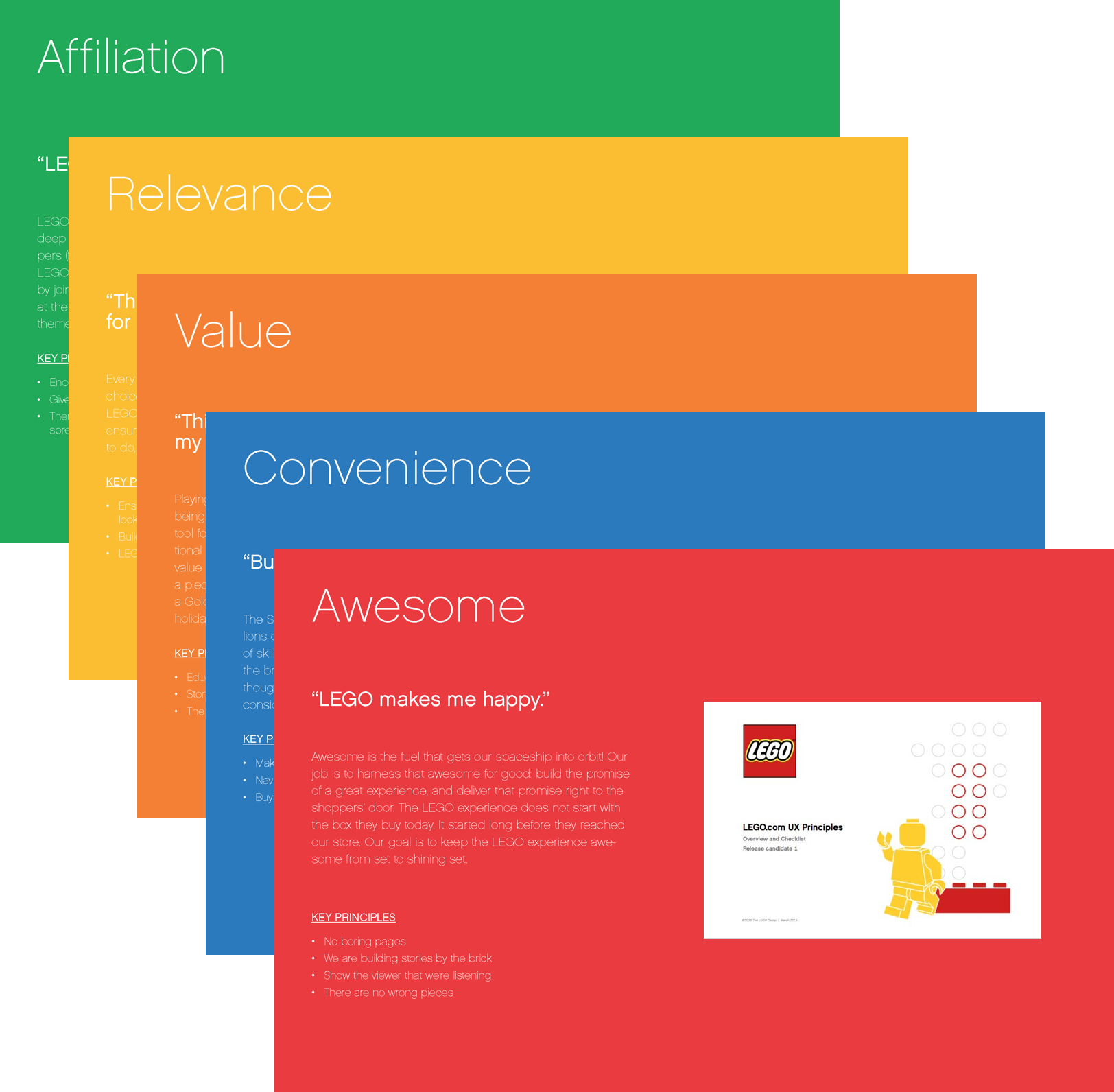
Highlight slides taken from design principles deck
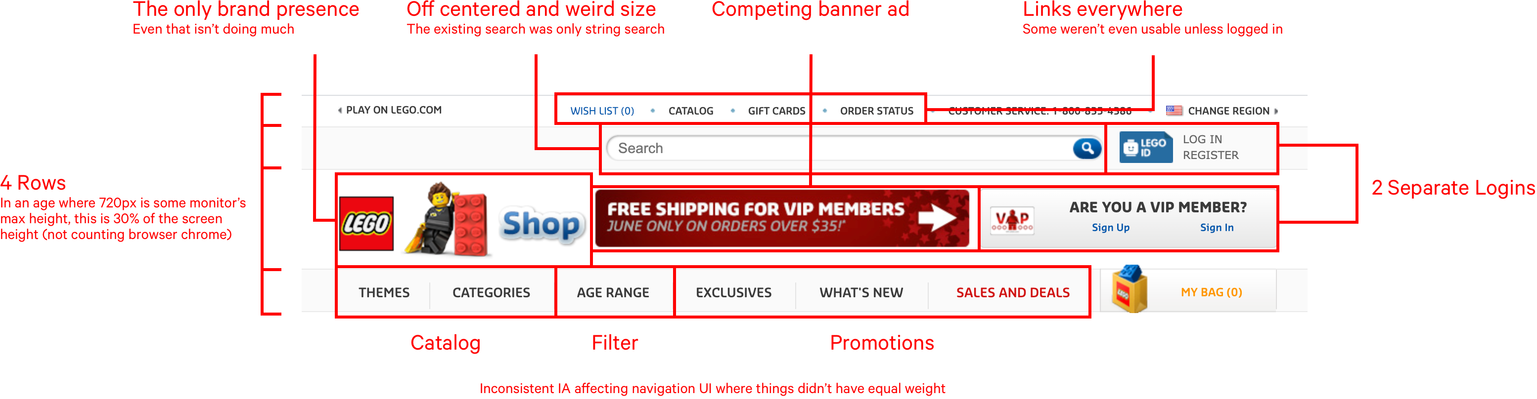
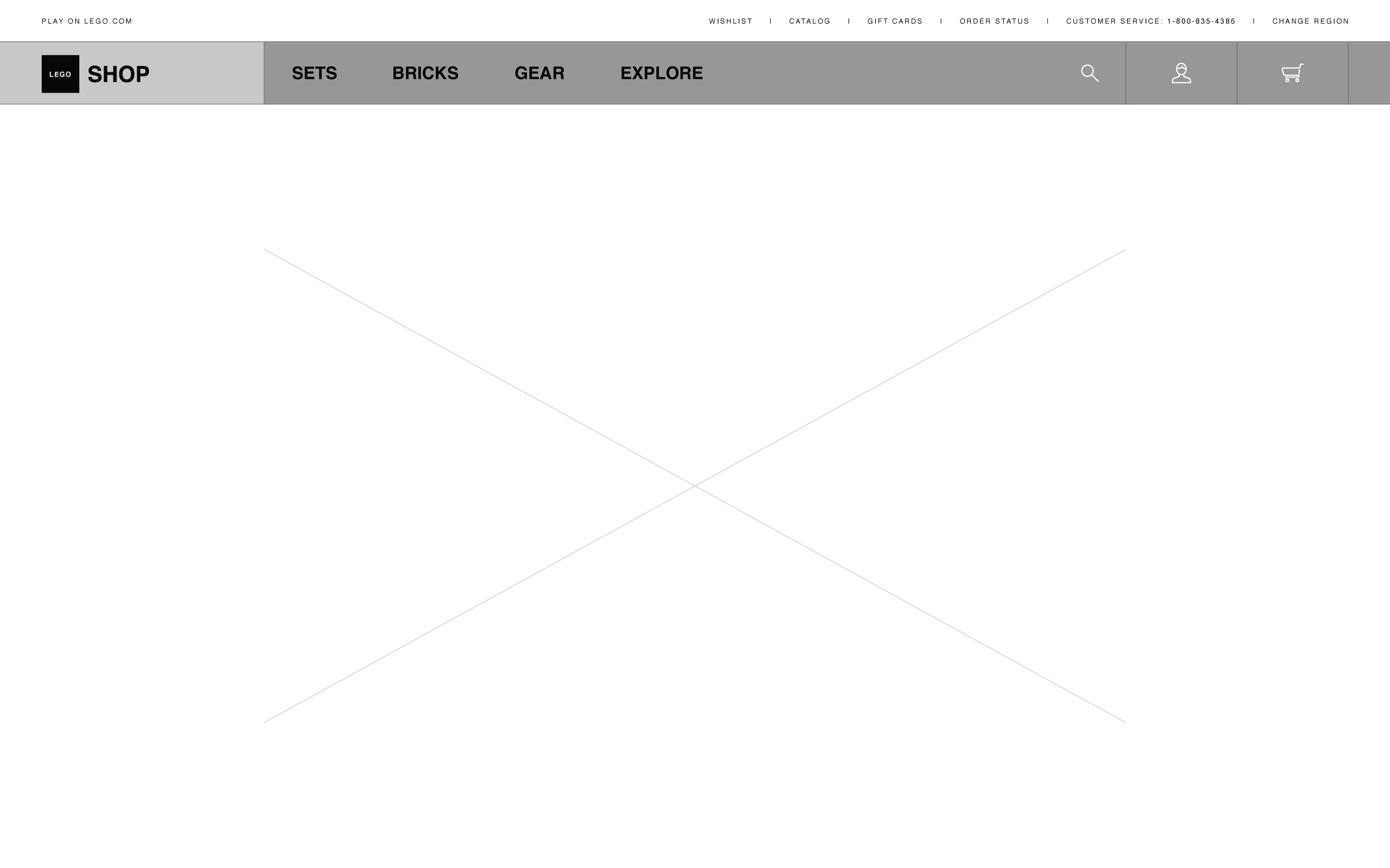
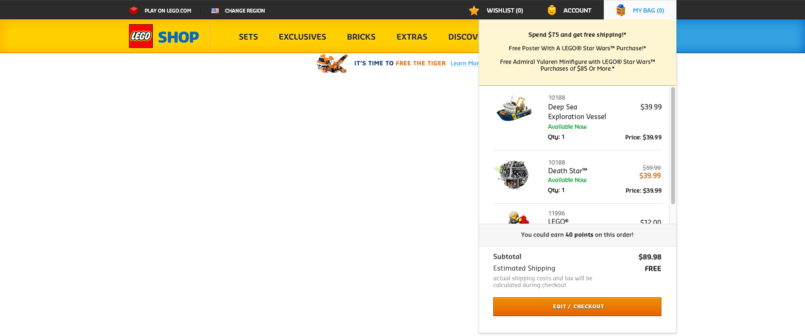
Existing Site
This was LEGO's e-commerce website before the redesign effort. It first went live in 2011 and besides basic content and merchandise updates the site had otherwise been left untouched.
So by the time I took on this project, which was 2015, the website was practically living on its last legs.
High Level Analysis
The list goes on...
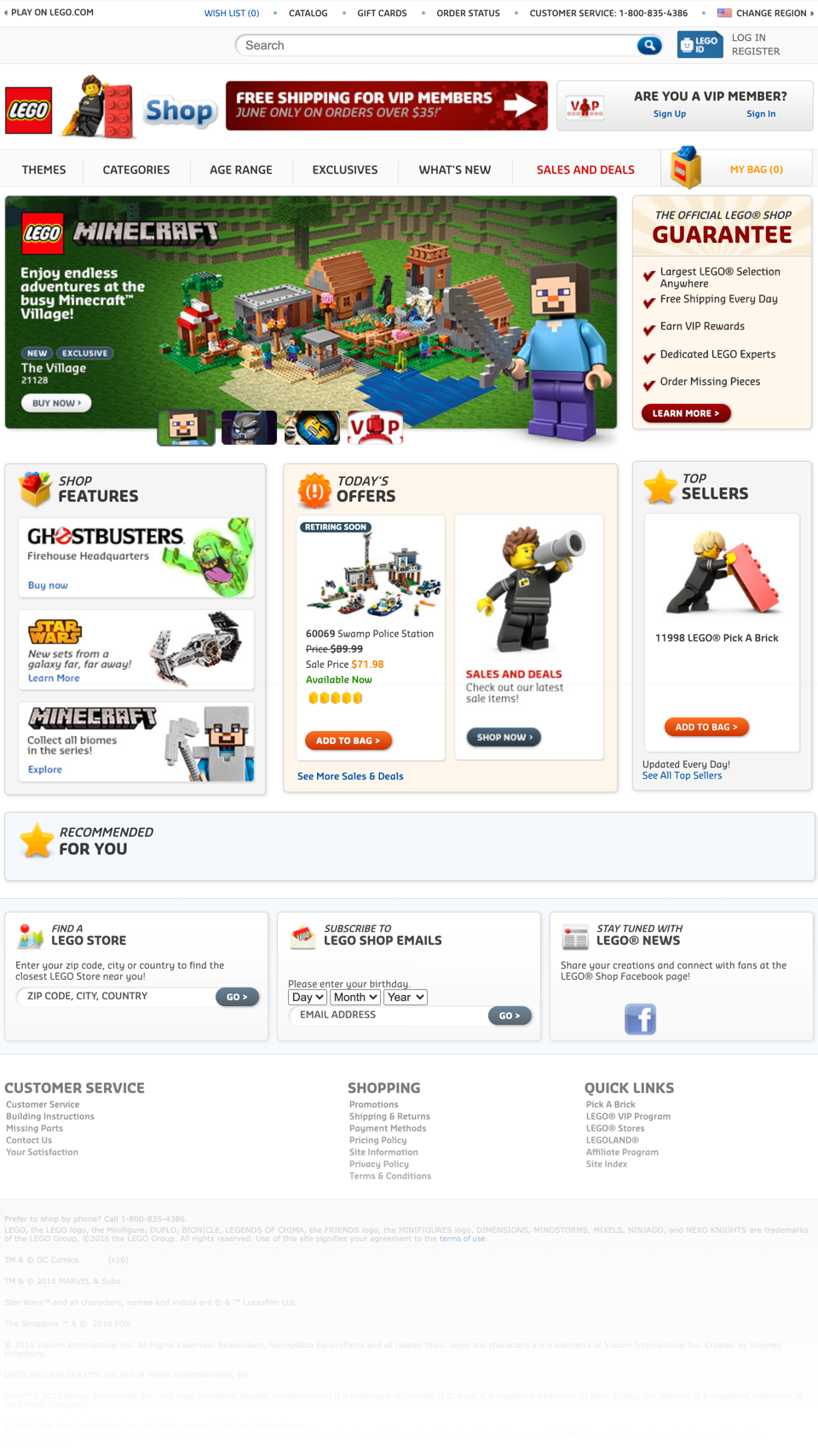
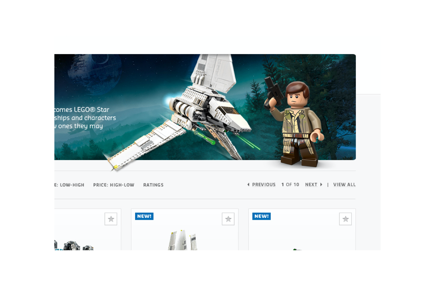
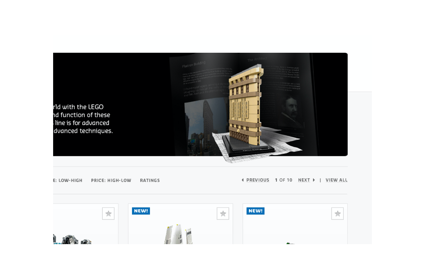
Screenshot of LEGO's original e-commerce homepage
Design Process
In an effort to keep this concise, I will be highlighting select parts of the redesign.
The whole work spanned across hundreds of modules for thousands of pages, so it would be impossible to show everything.
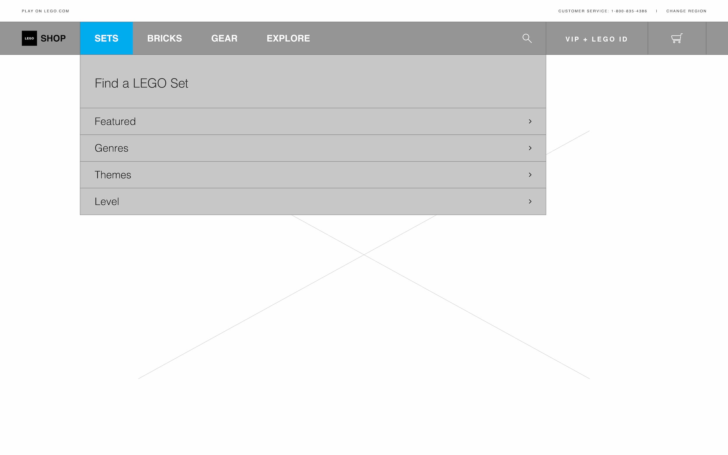
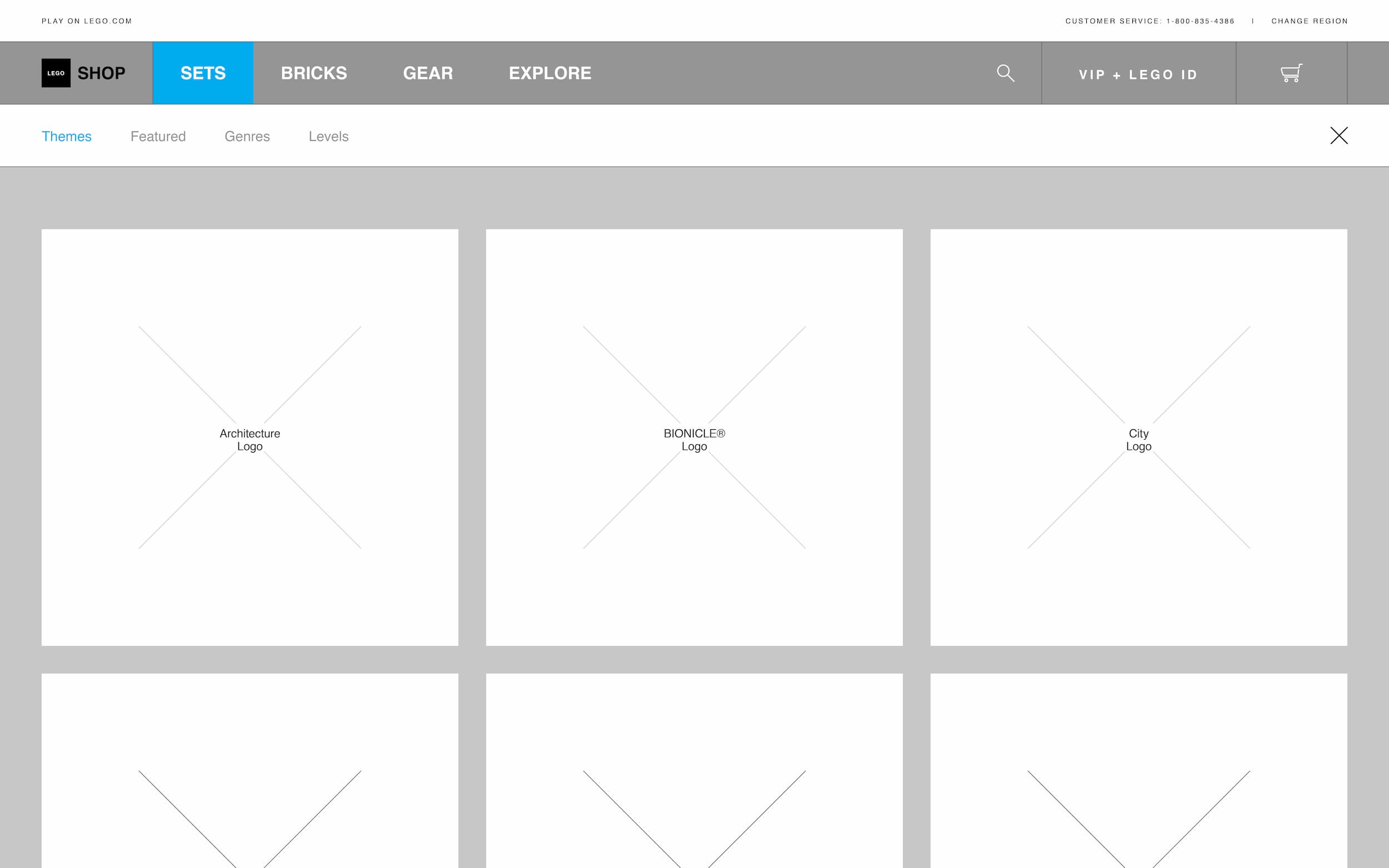
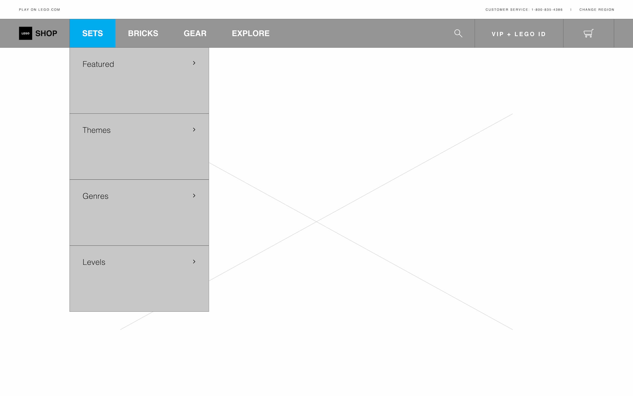
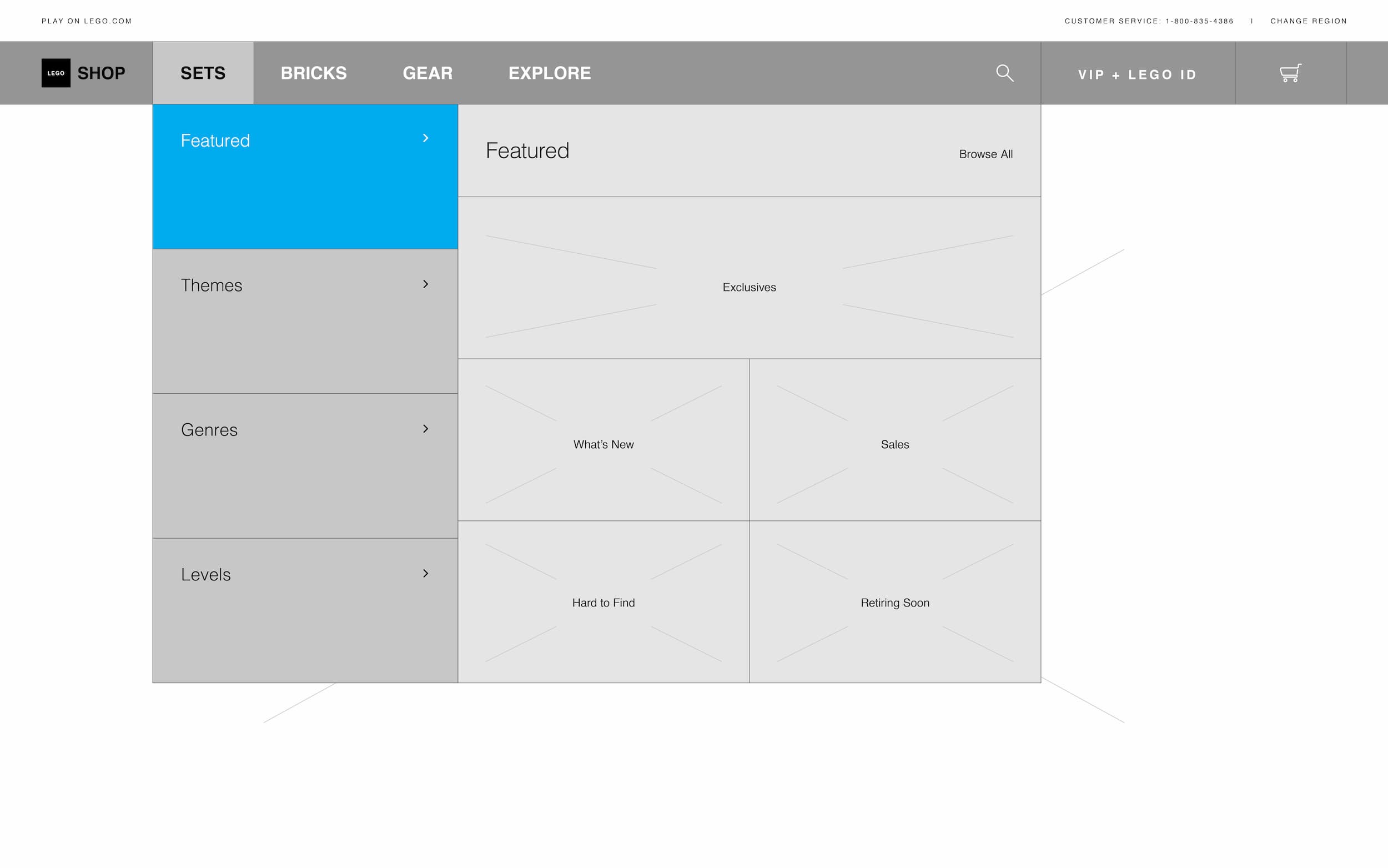
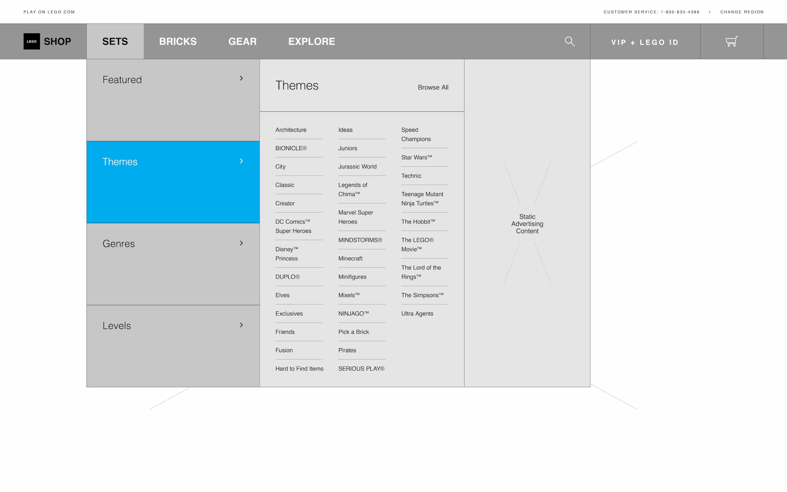
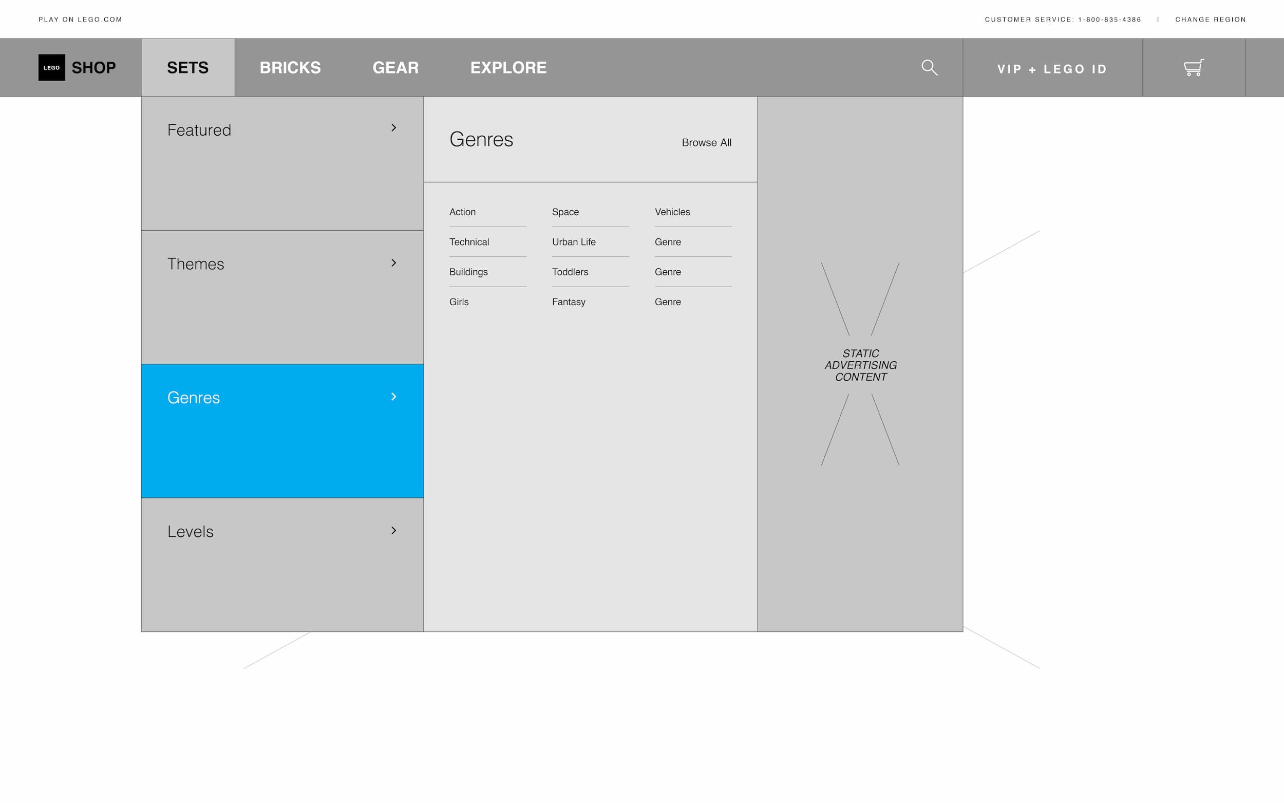
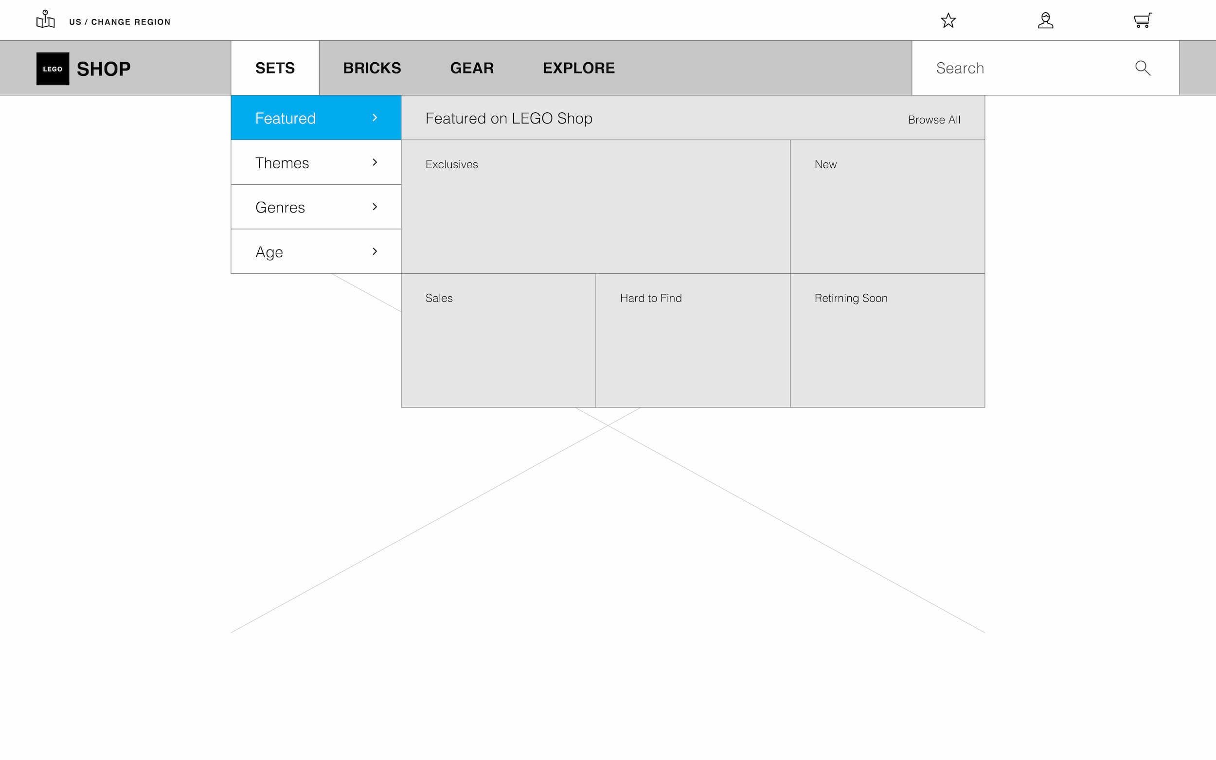
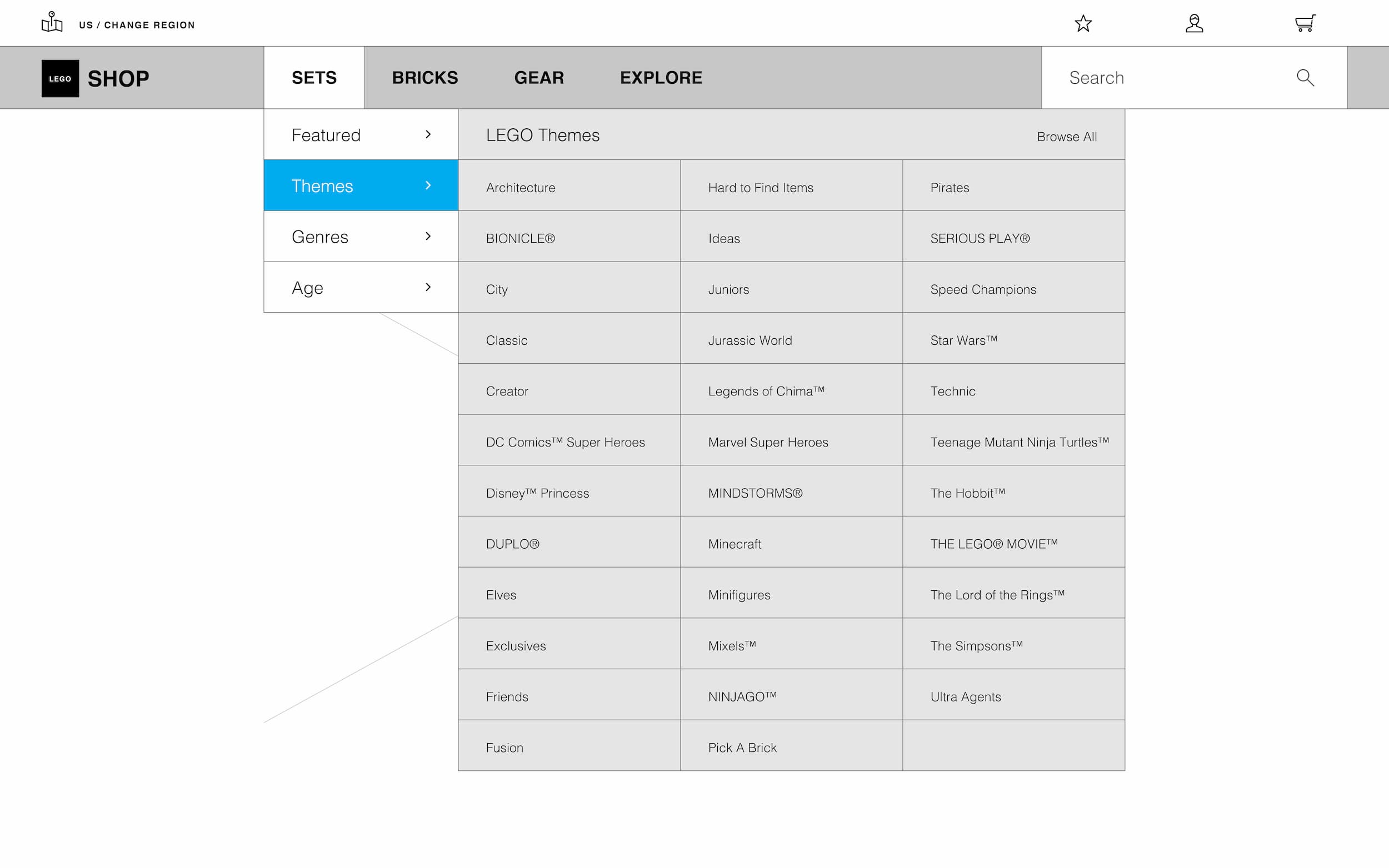
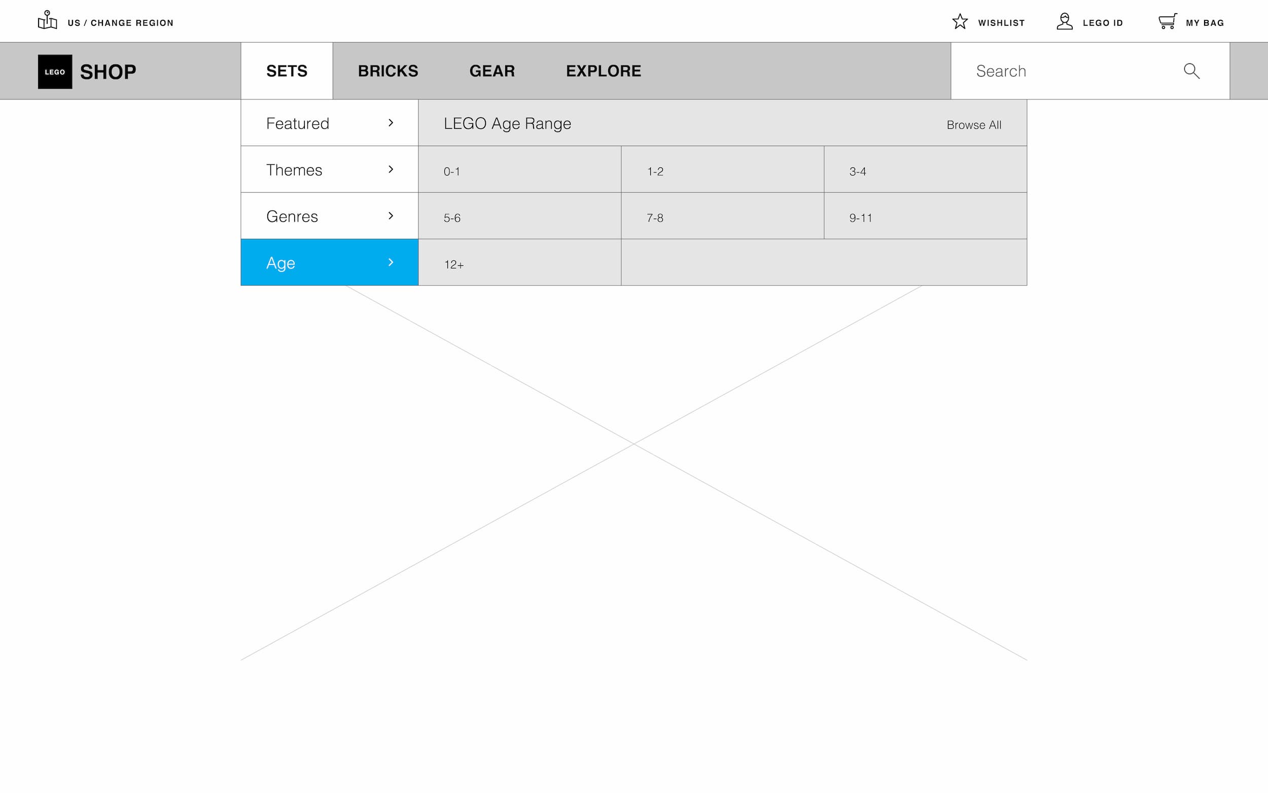
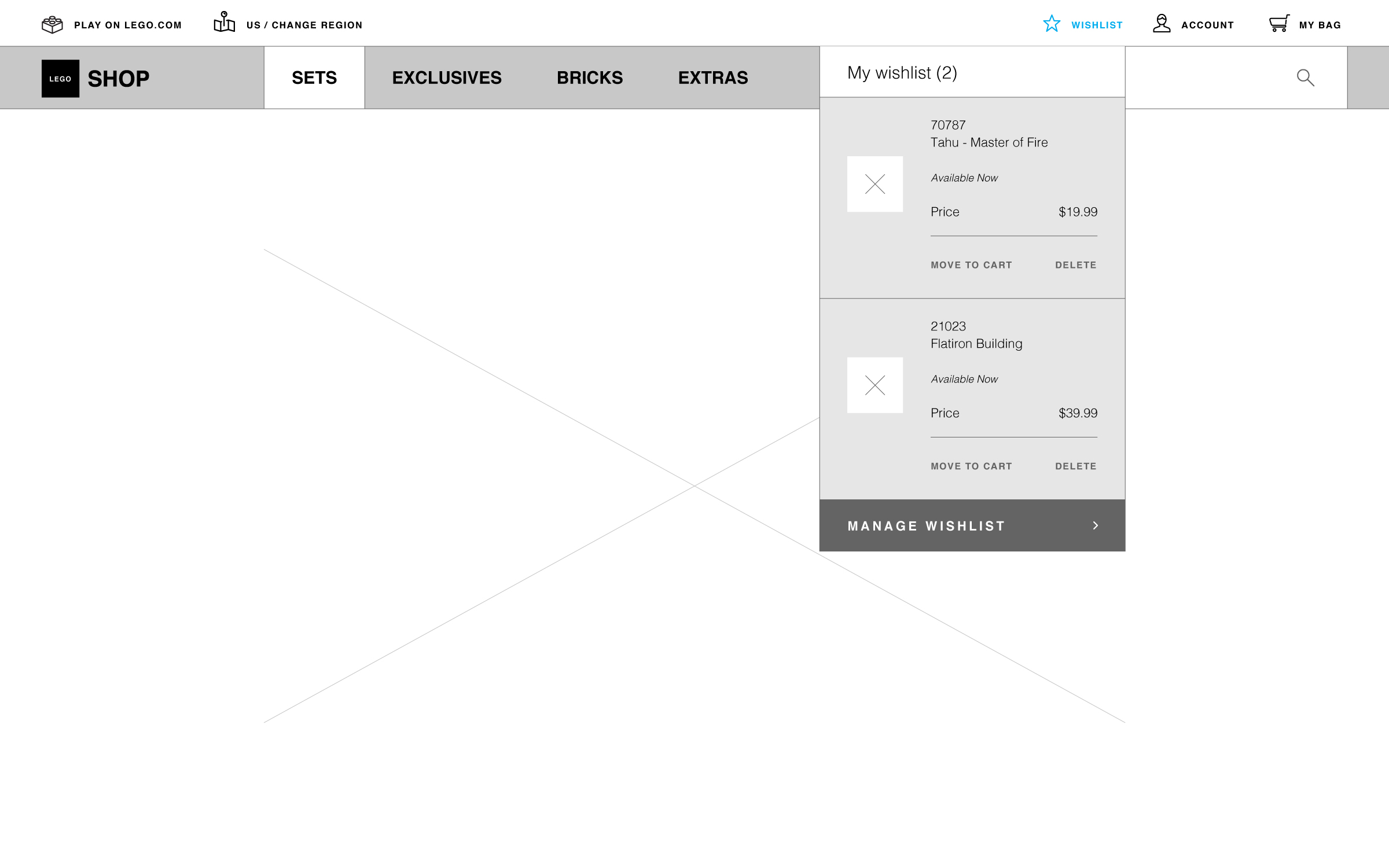
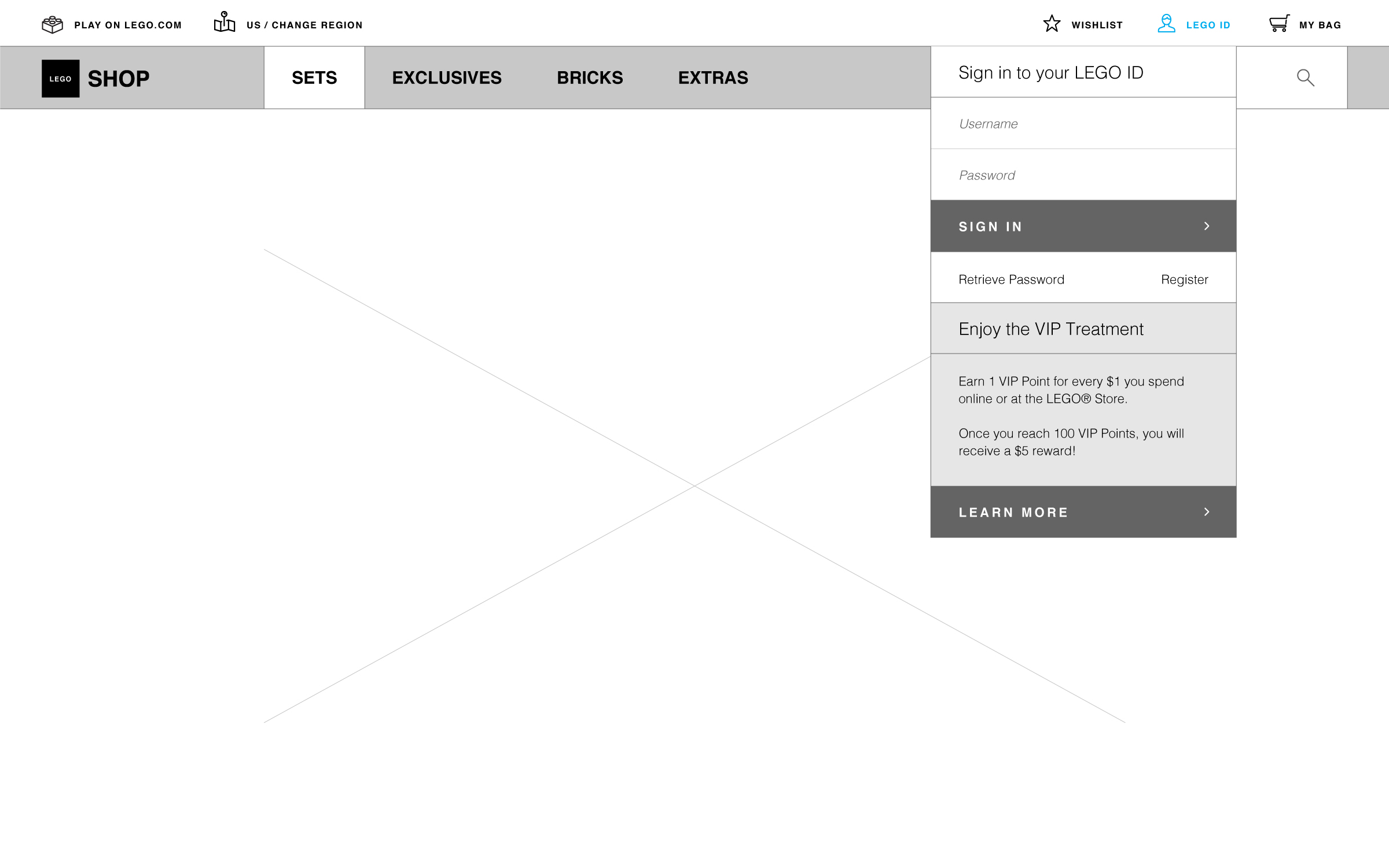
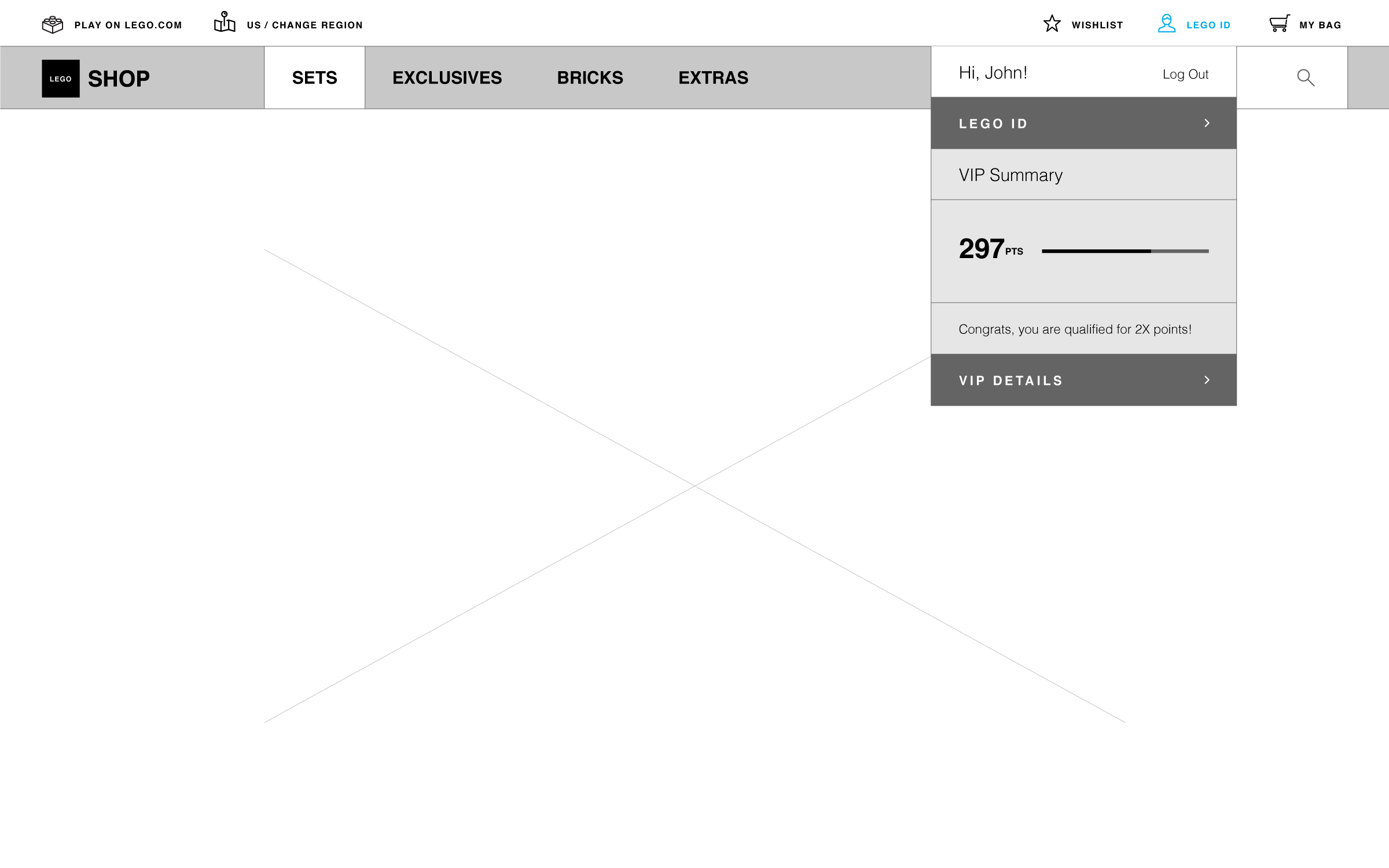
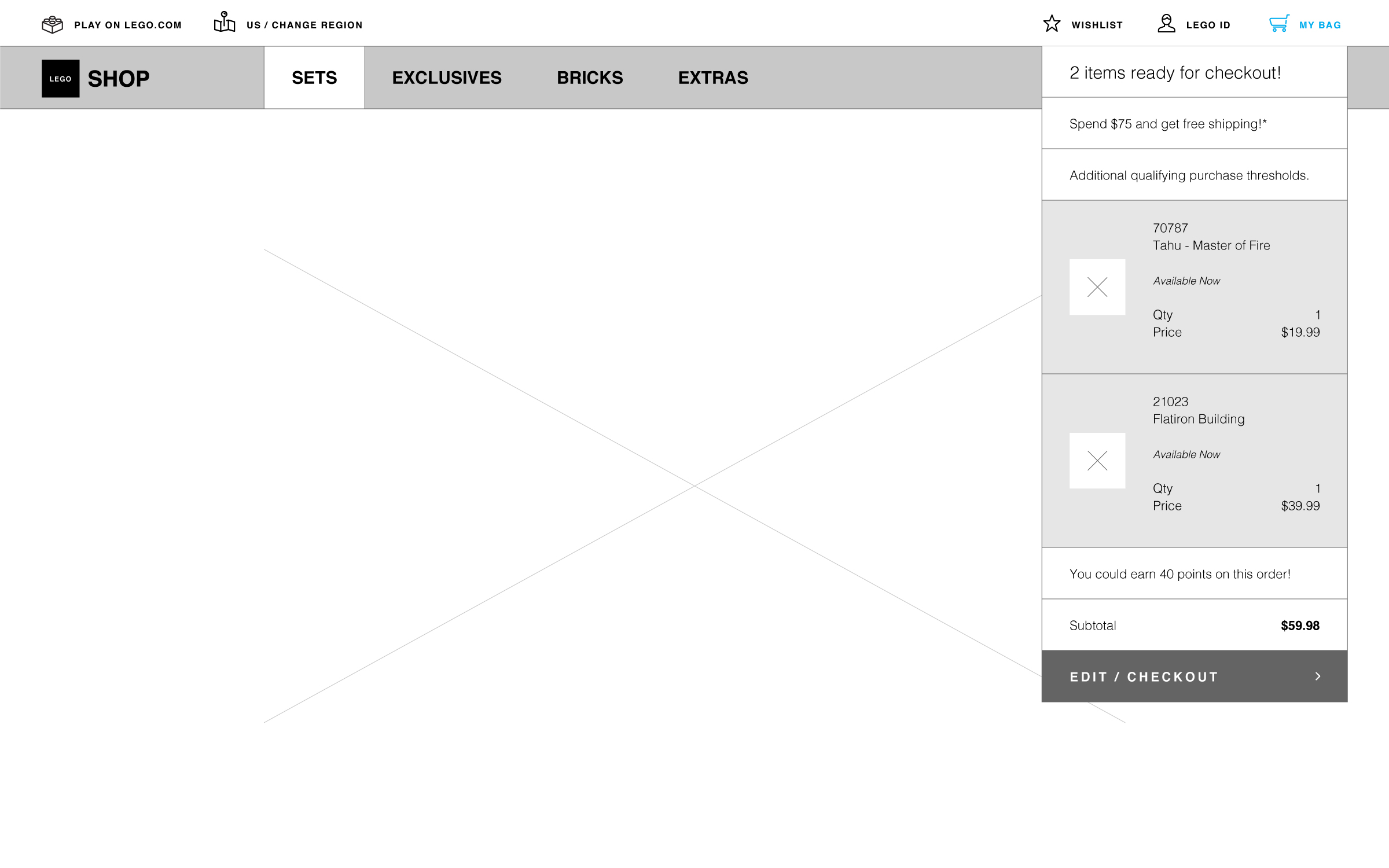
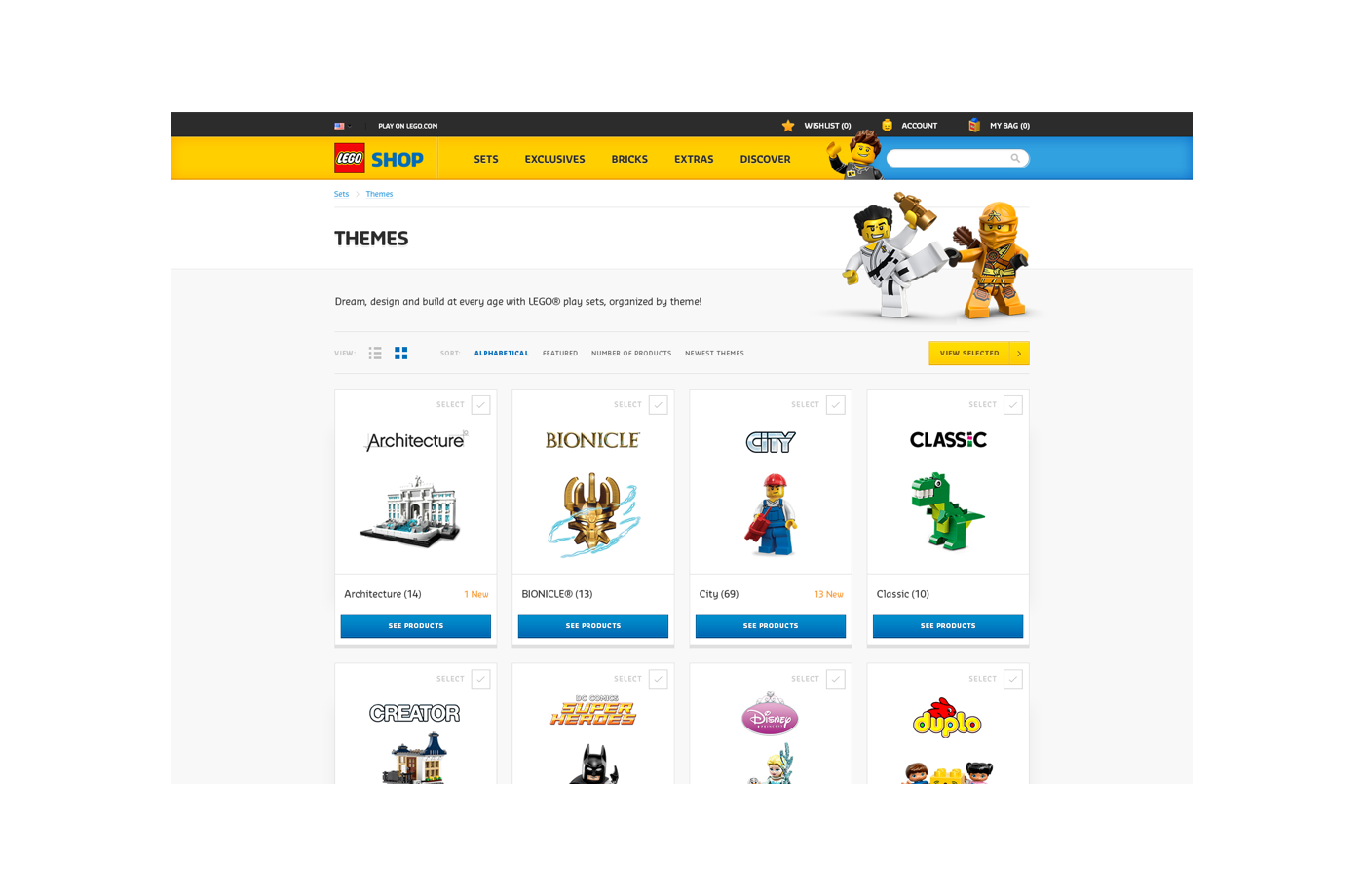
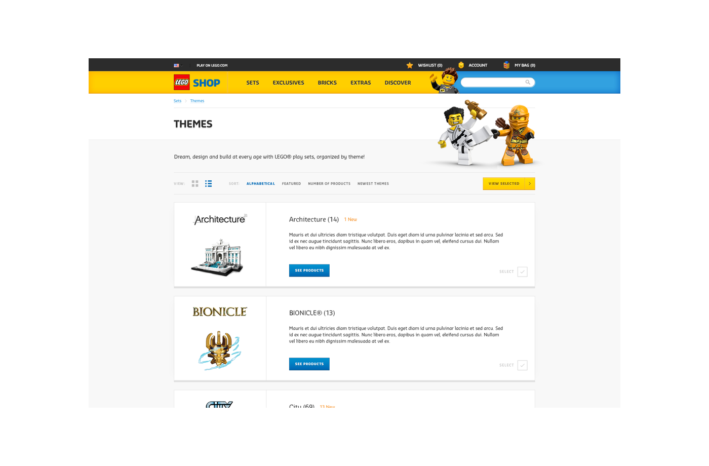
Navigation and IA
After my initial analysis, I was convinced that this was the most important part to get right and thus was where I focused my early efforts. The existing solution just needed an absolute overhaul and from a UX point of view, navigation (being able to efficiently find things) in e-commerce is the most critical piece.
Analyzing The Existing
Early Explorations
From a design standpoint, the biggest thing was definitely to reduce and condense wherever I could. If things were redundant then they were killed and if things were related then they were combined.
Important note: I was working on the IA simultaneously, so the taxonomy in the screens throughout will be different. All designs in the process were also done mobile first, however I will mostly only show desktop to keep it concise.
Subset of the early concepts and explorations
Testing It
By utilizing tools like usertesting.com, I was able to quickly decipher what worked and what didn't relatively quick. Besides the obvious usability testing, I also got to indirectly see if the designs were an improvement by simply setting a screener for people who have used or made purchase on shop.lego.com and then just seeing what they had to say.
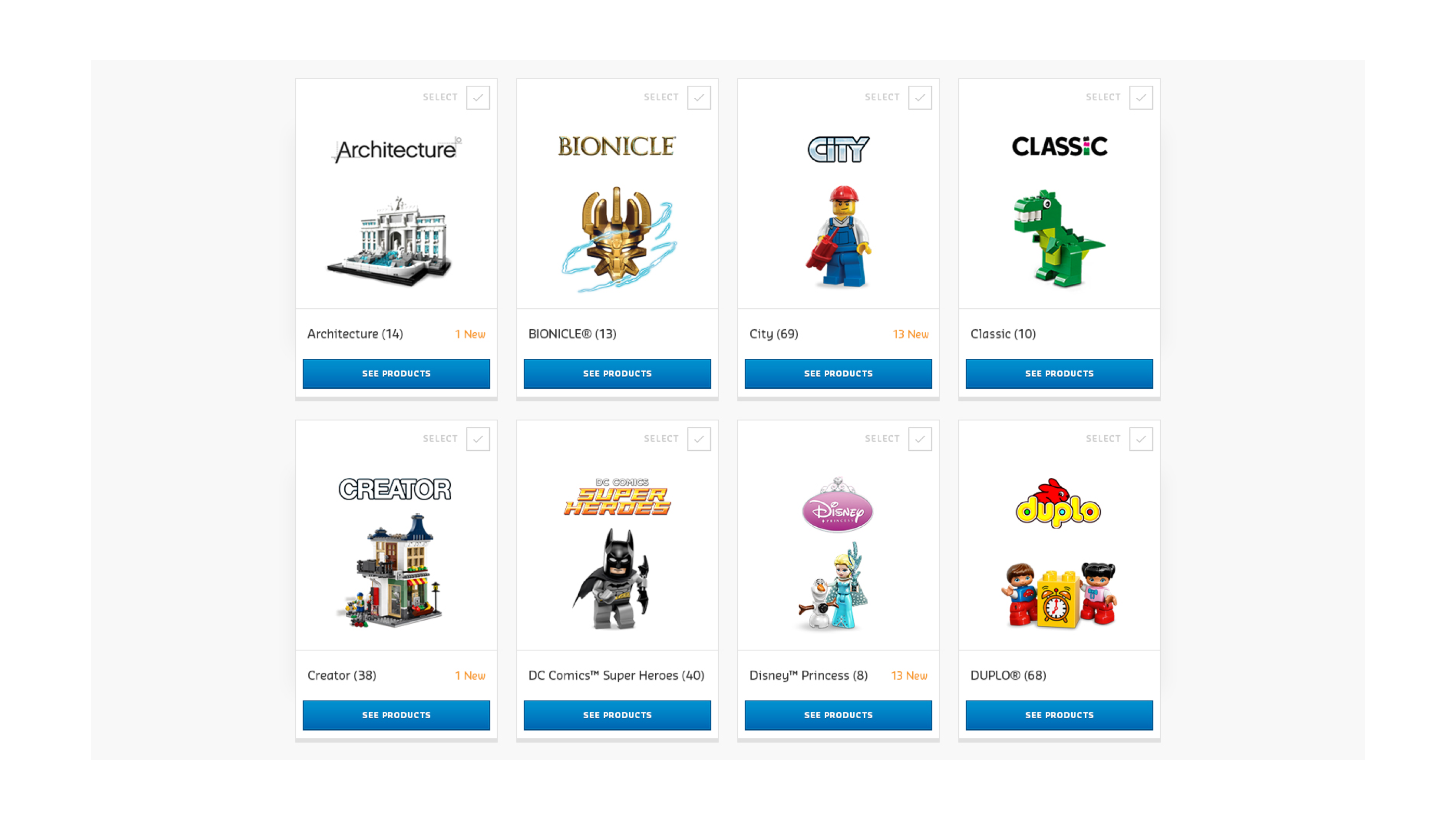
Taxonomy
As mentioned earlier, I was also working on the information architecture during this time. In the old site, there were a lot of overlapping sections and categories. In some instances certain modules were given no parents and thus were linked all over the place (some even at root level like the 'age range' filter).
To remedy this I went through the whole site and did a sorting exercise. I grouped, removed, and created new sections, e.g. in the old site 'categories' was essentially just tags given to different product themes, but it shared the same level as the actual LEGO themes. 'Exclusives', 'What's New', and 'Sales and Deals' were all promotions, but there was no overarching promotion category so they all had their own section and lived on the homepage. And then there were things like certain cateogry tags that were actually promotions, but for some reason were listed under categories instead.
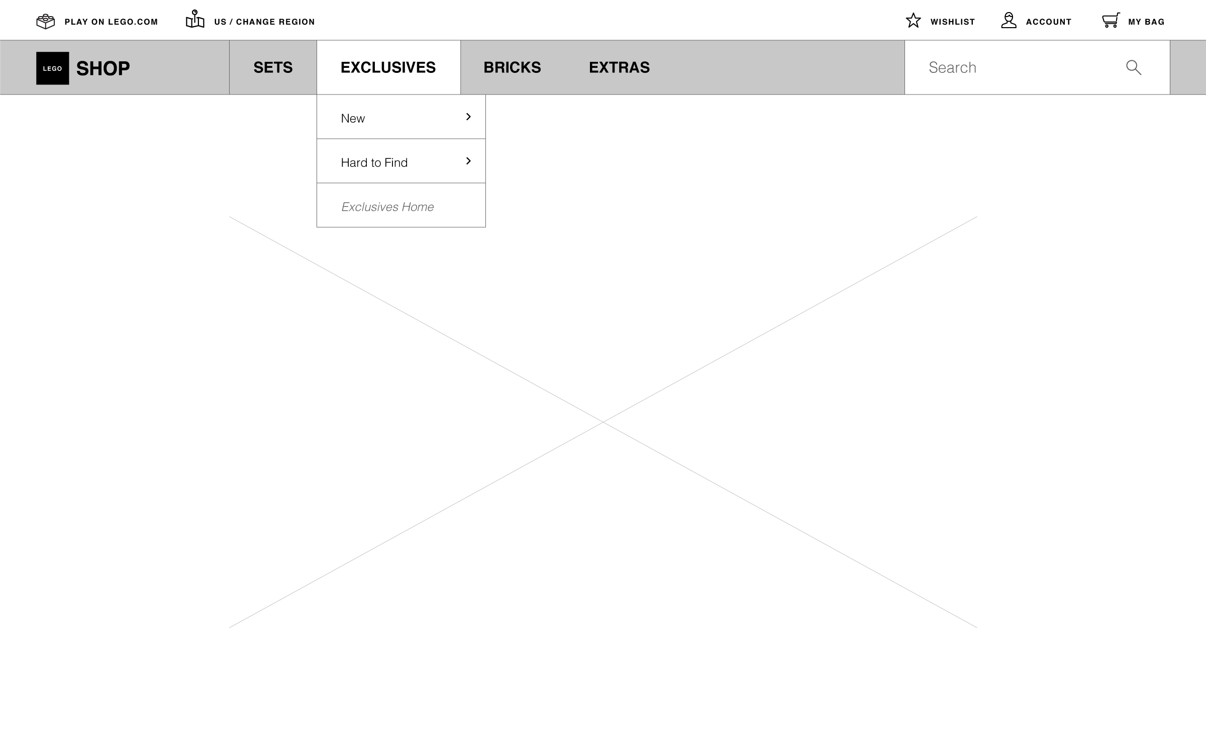
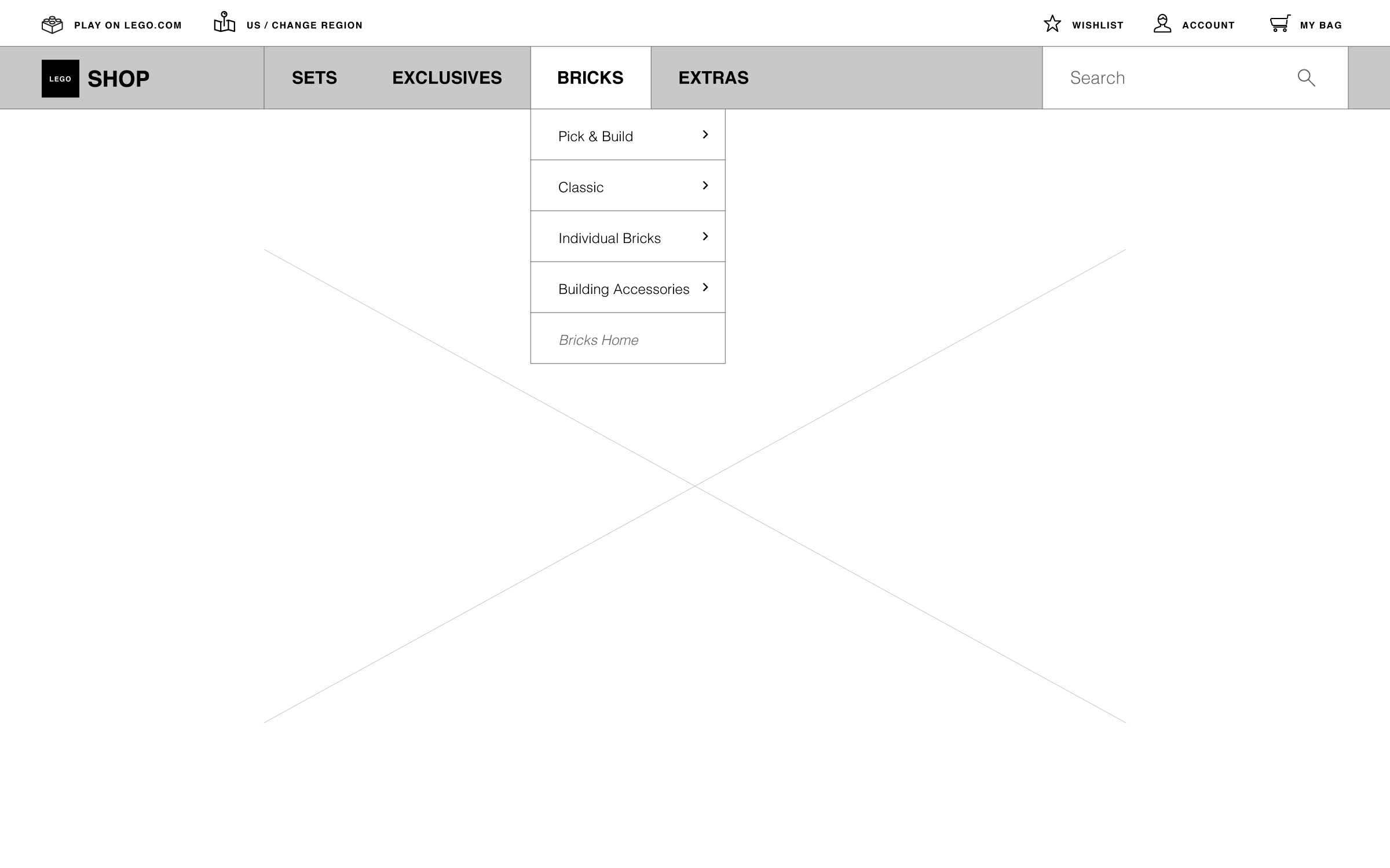
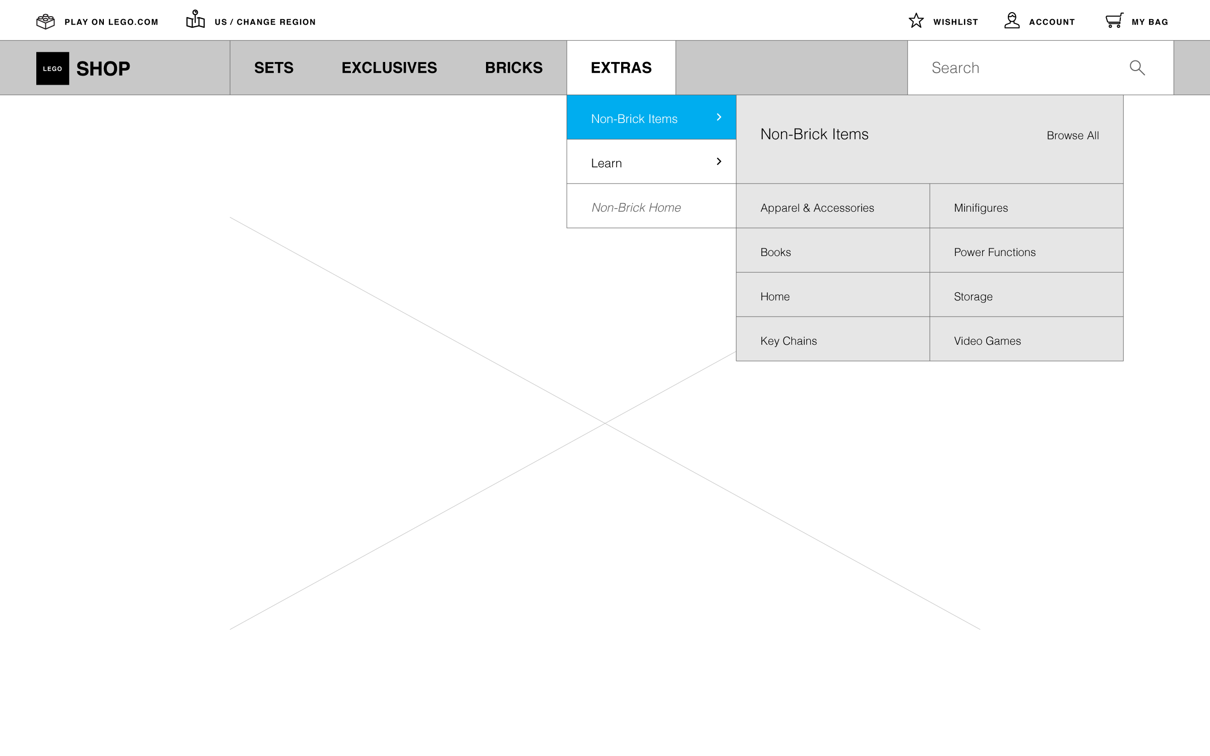
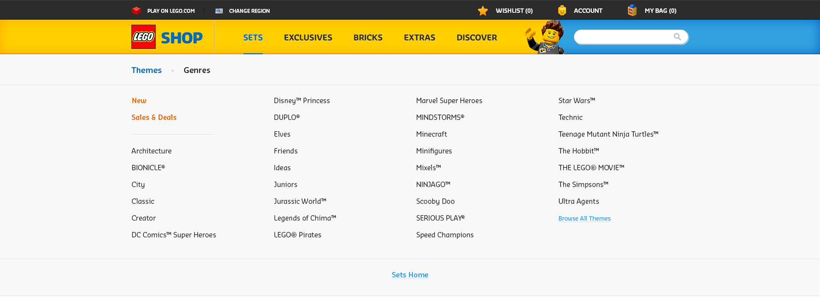
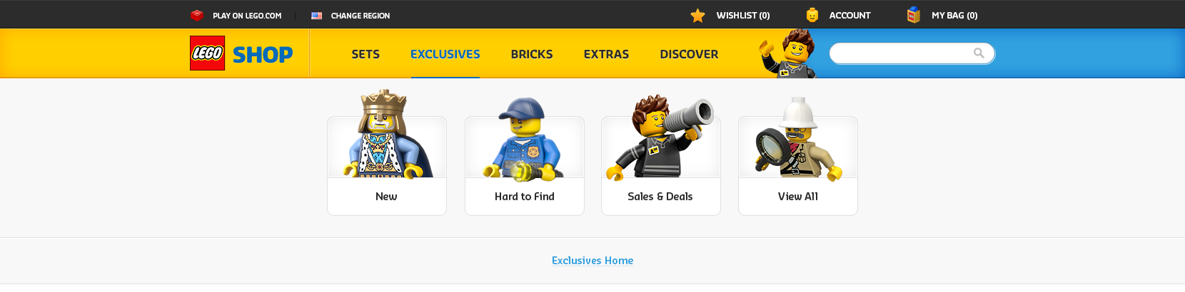
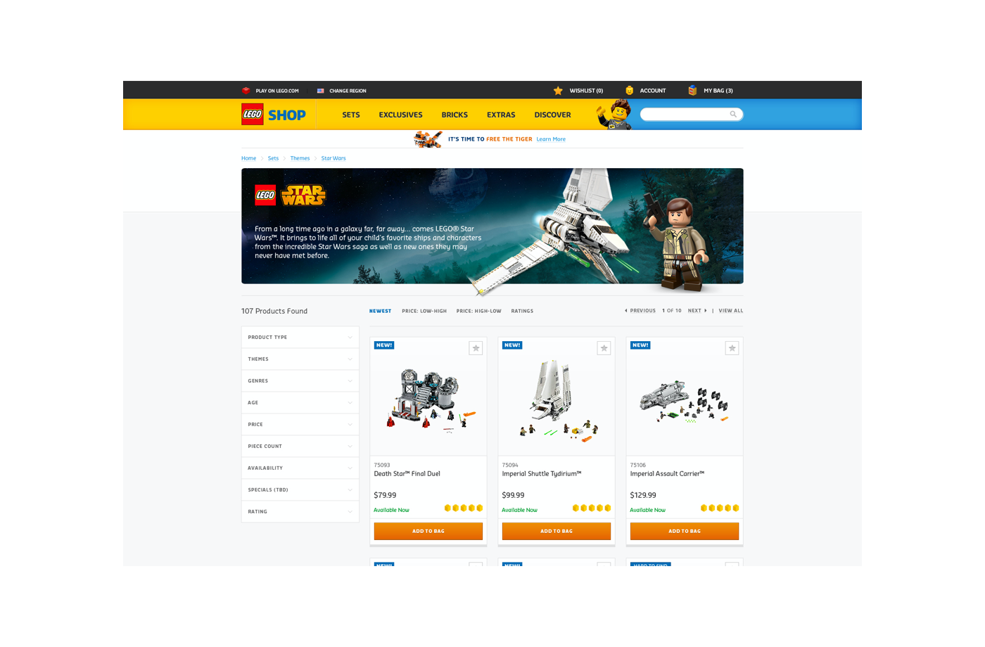
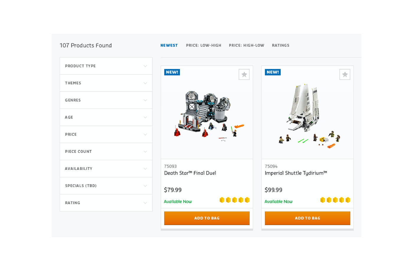
In terms of taxonomy, the goal was to simplify the top as much as possible and I concluded with Sets, Exclusives, Bricks, and Extras.
Obviously each section was then further broken down, but the key thing here is theres now a clear hieracrchy to the website.
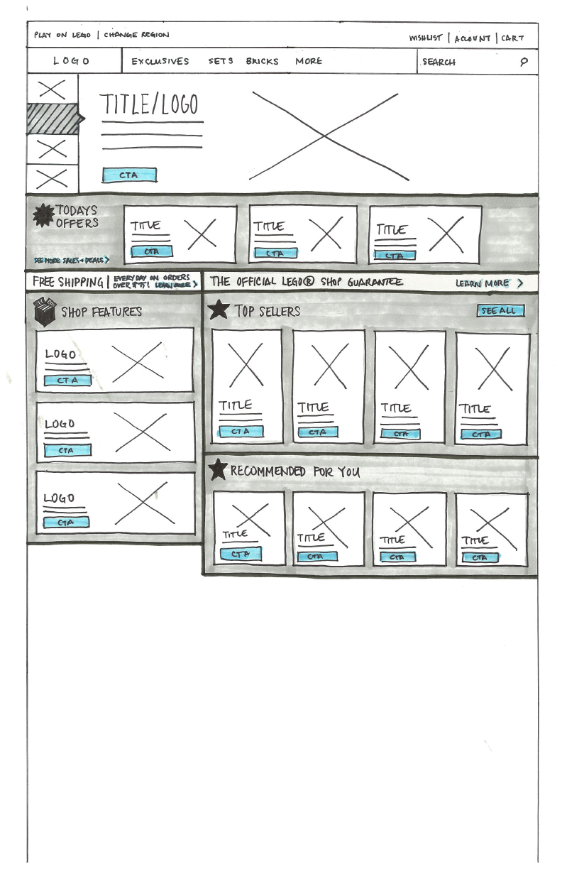
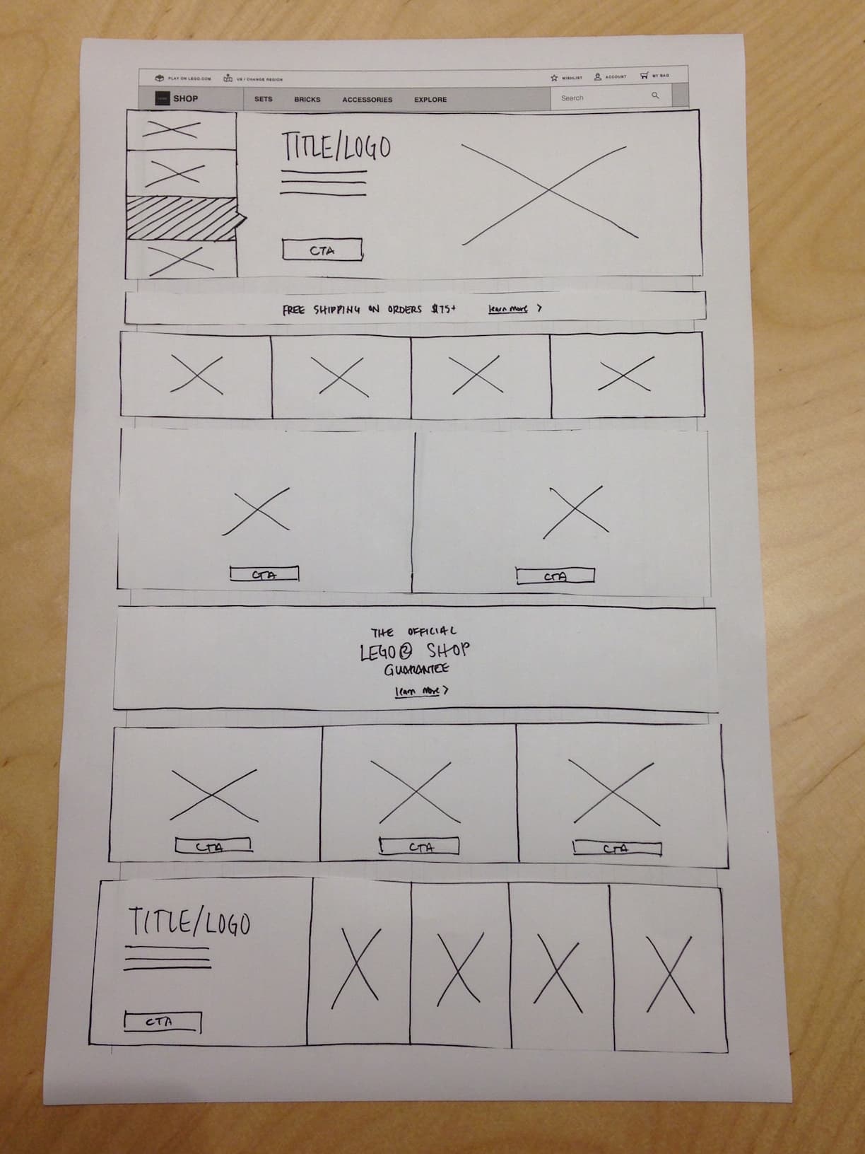
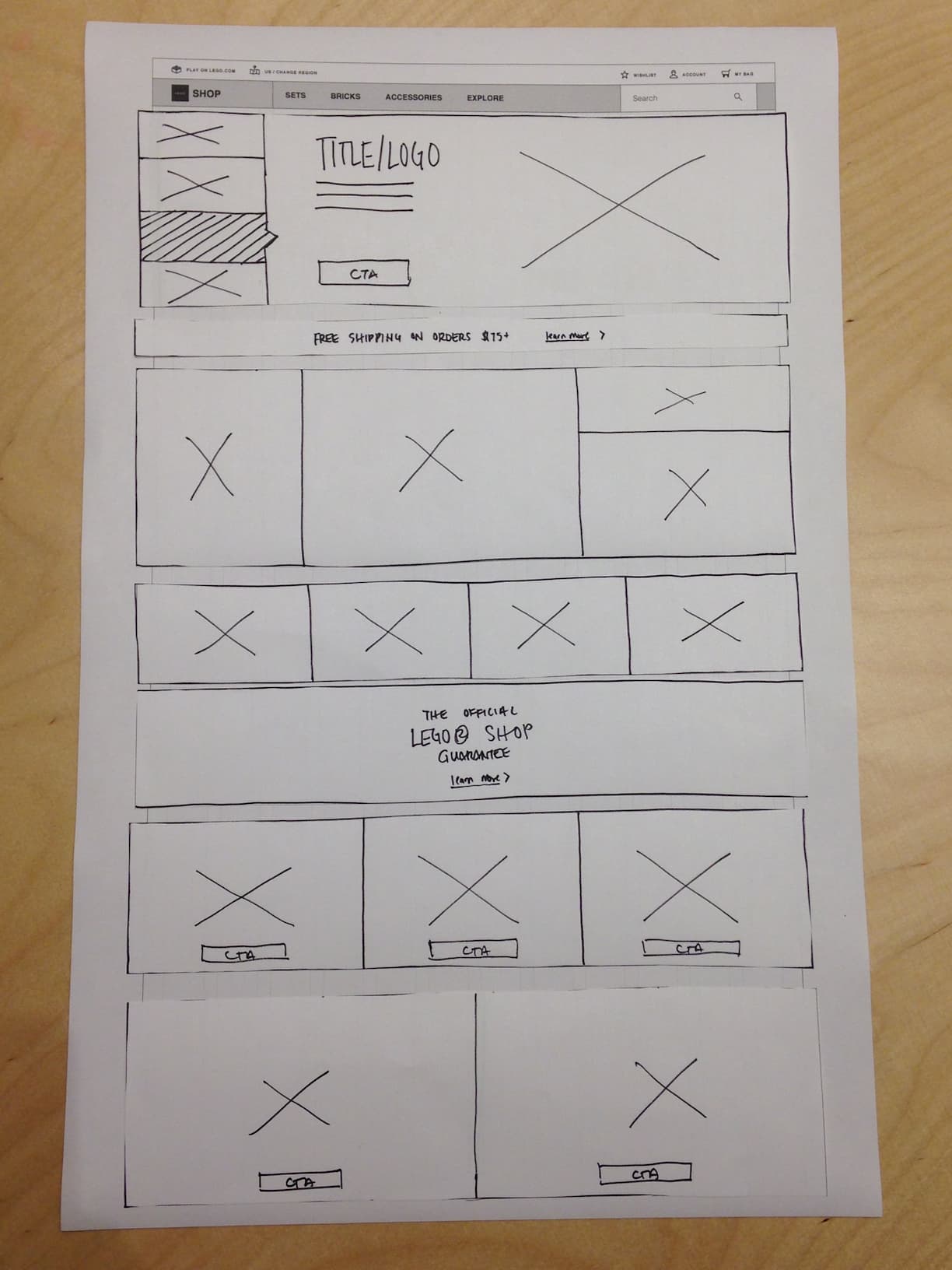
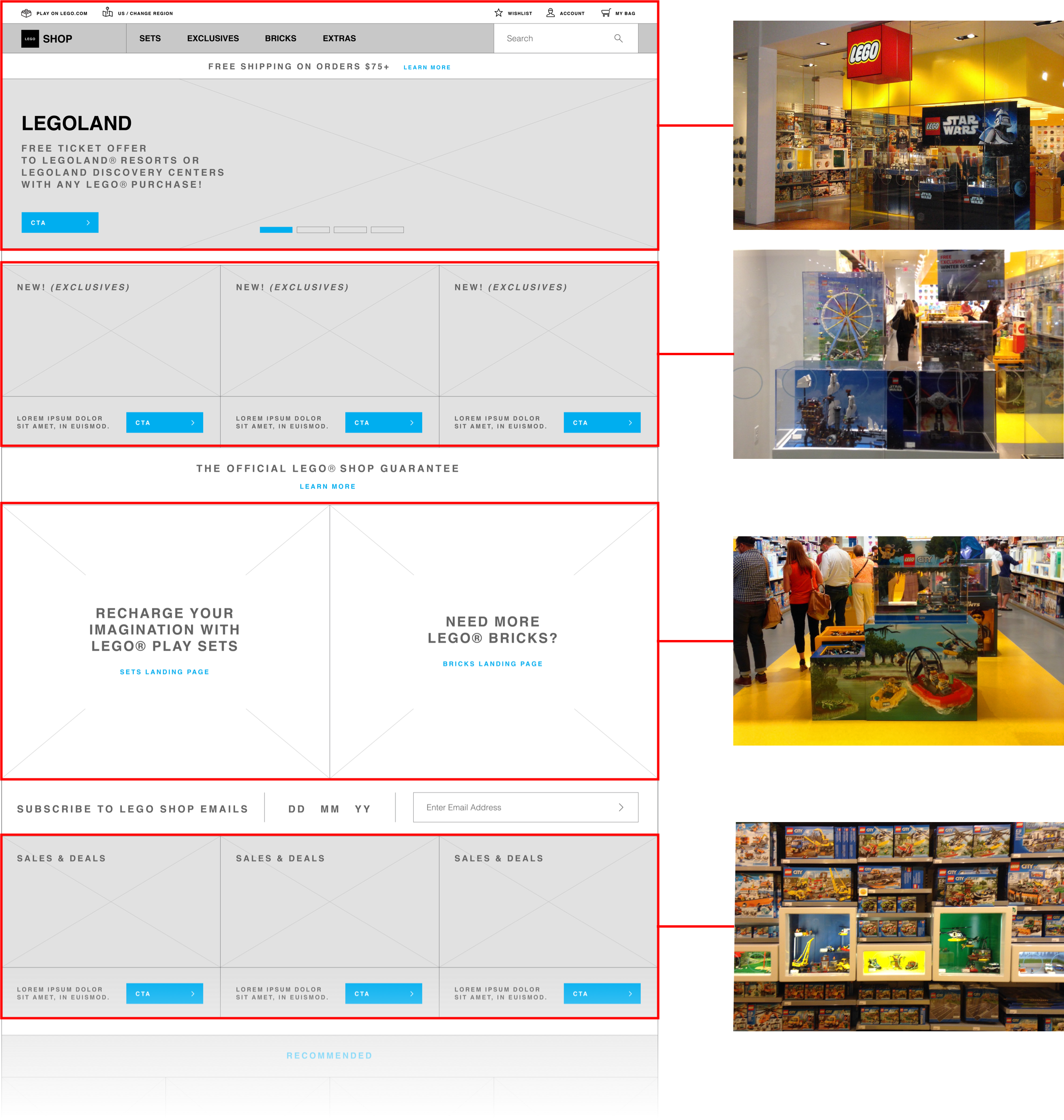
Final Wireframes
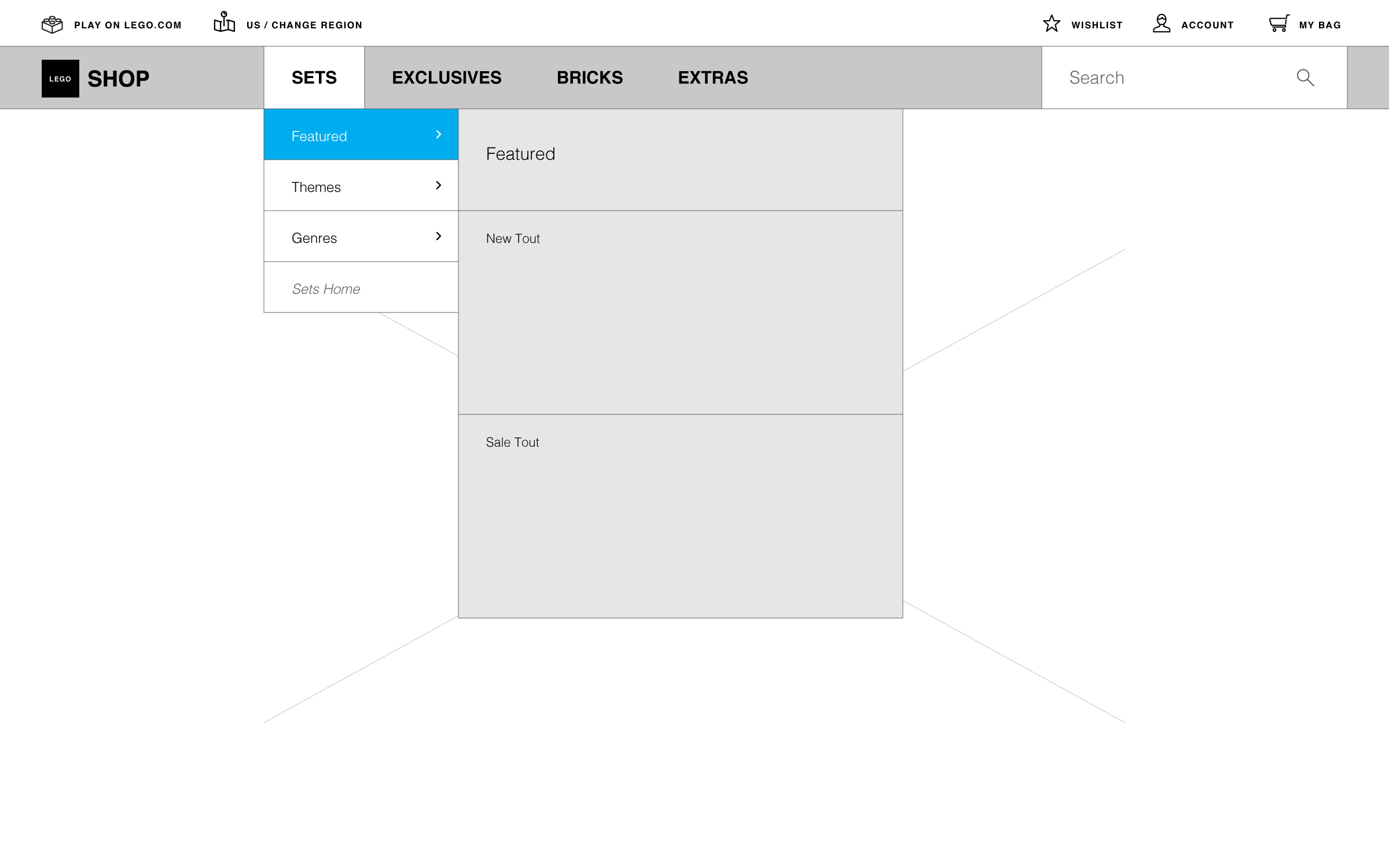
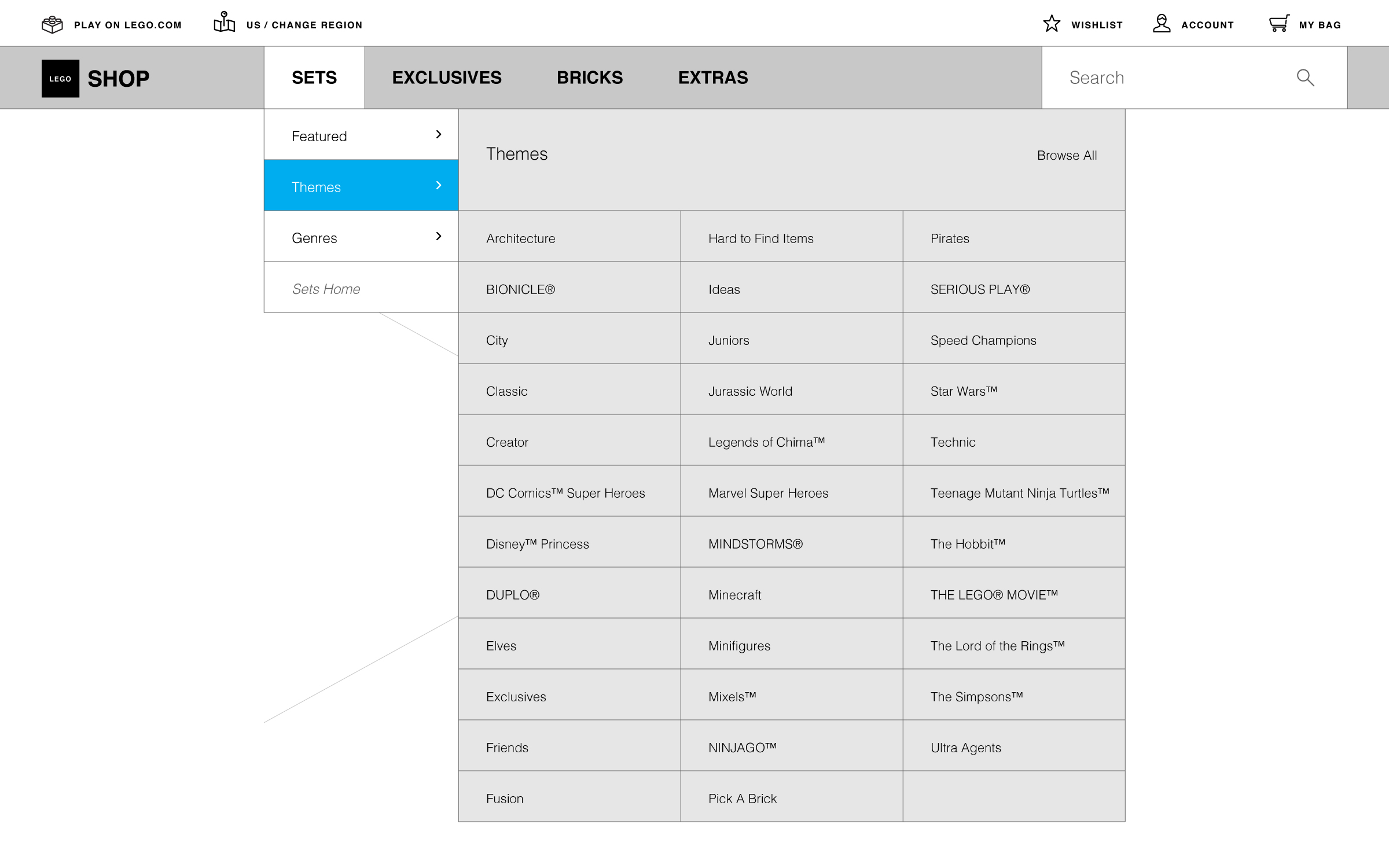
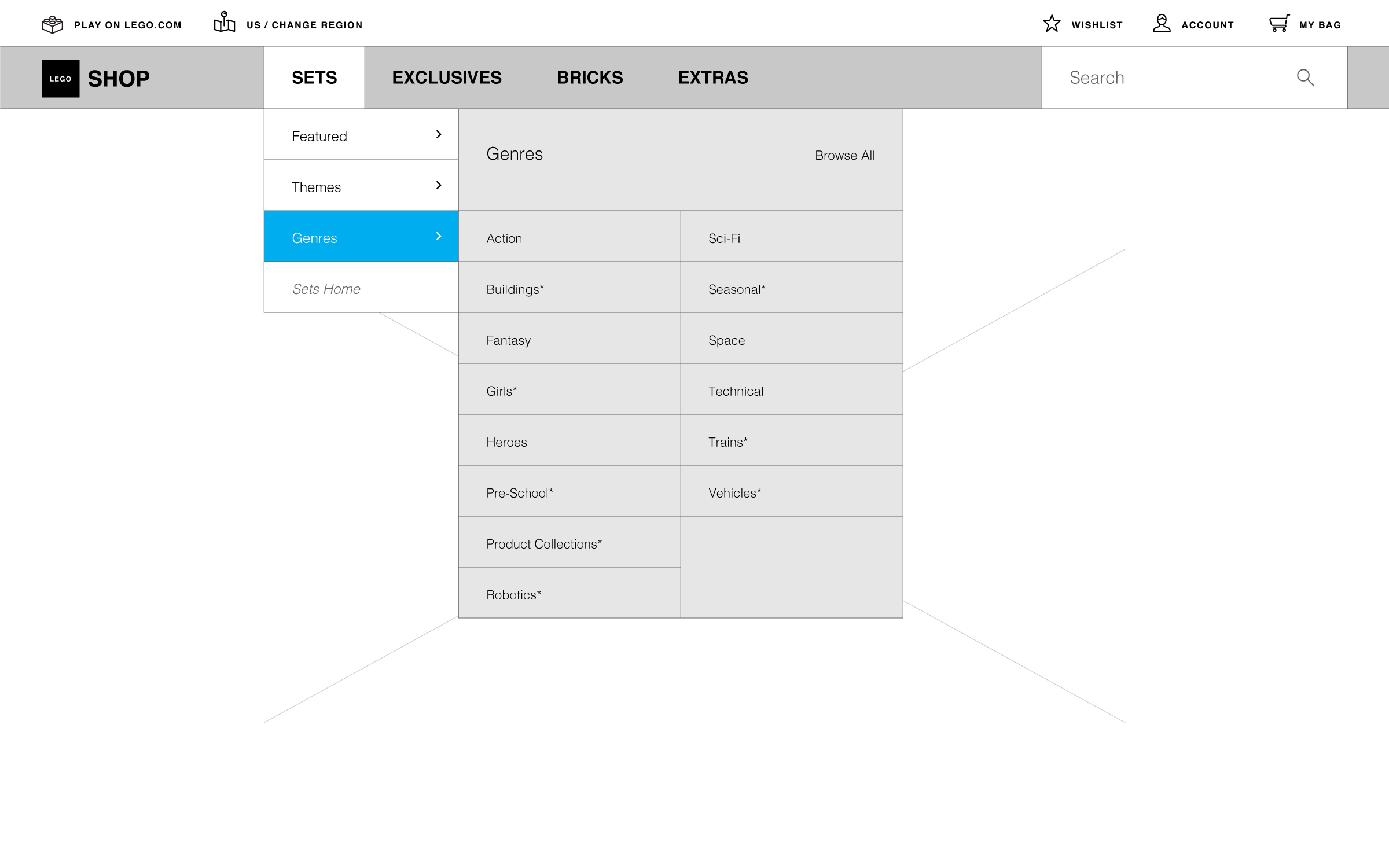
This was the final wireframe version (additional evolution happened within UI)
Visual Design Direction
Before my team and I could proceed and create any UI, I had to first come up with the visual design direction. During this time, most e-commerce platforms for the biggest brands favored a clean minimalistic look. But deep down inside I felt that wouldn't be right. LEGO as a brand has a very unique personality, so going with the trend just didn't make any sense. I wanted to come up with a direction that would make sense for a special brand like LEGO.
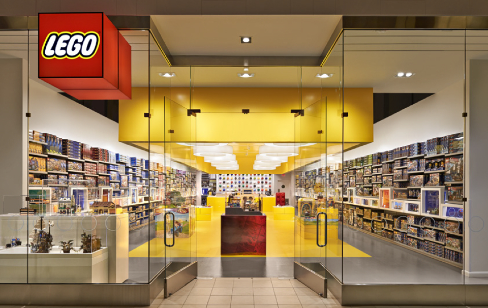
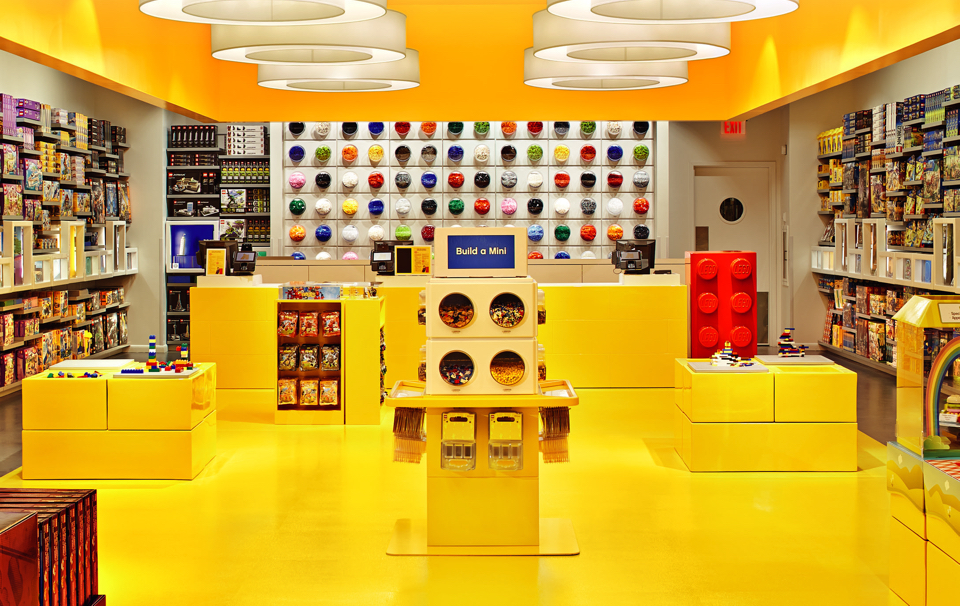
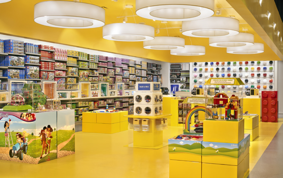
I spent a good couple weeks thinking about this and eventually the inspiration came when I visited a LEGO store on one of my days off. What's funny is I had visited this store many times before, but this time it felt different. The sharp yellow took my breath away. For once, I noticed the contrast it created against the two adjacent stores—both of which had a very empty and white feel. Once inside I immediately sensed the fun and joy, and that's when I realized the direction was there all along. I didn't need to create something 'new', I just needed to bring the already hugely successful retail experience to the web.
I named it Store Gone Digital.
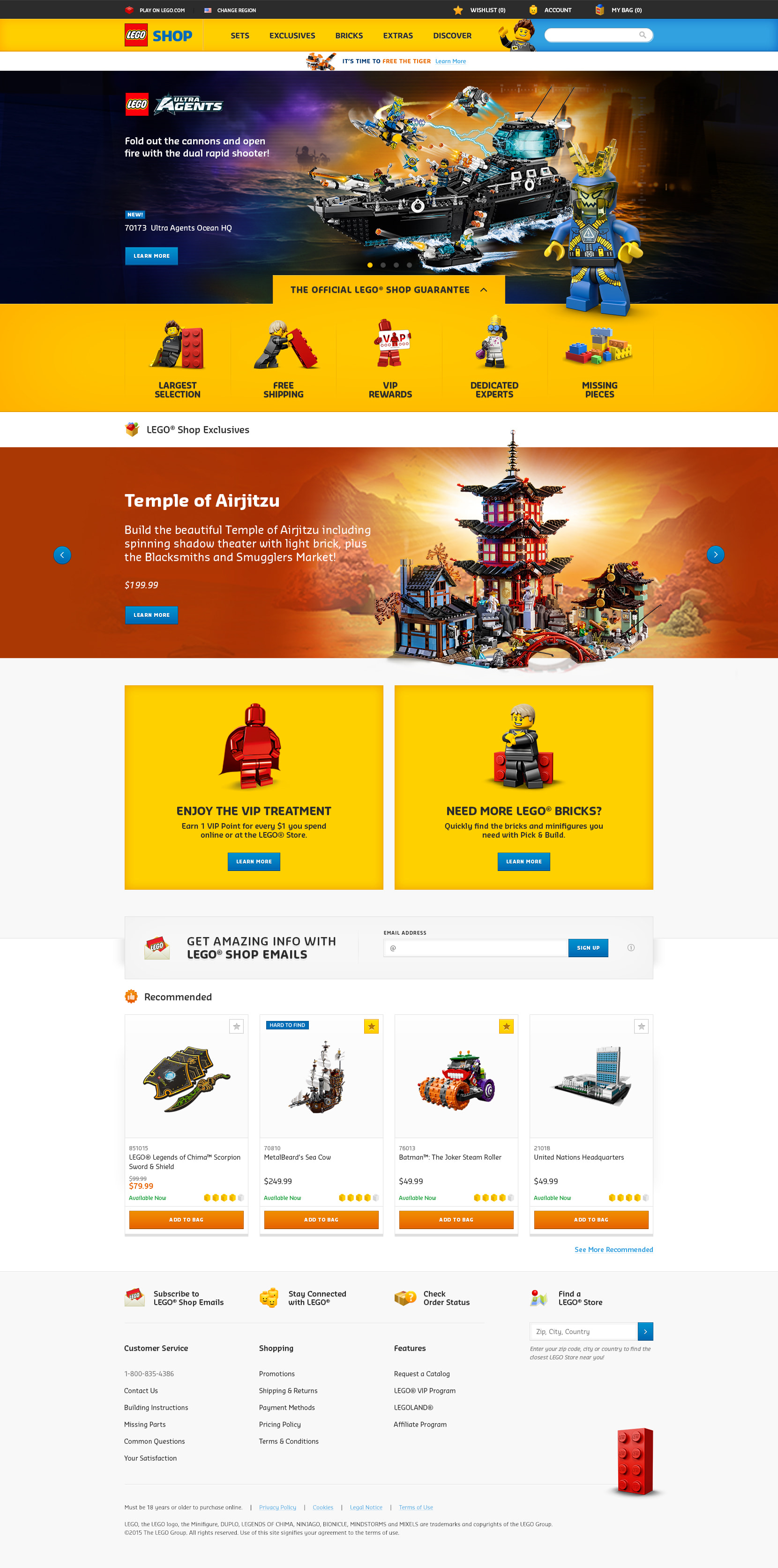
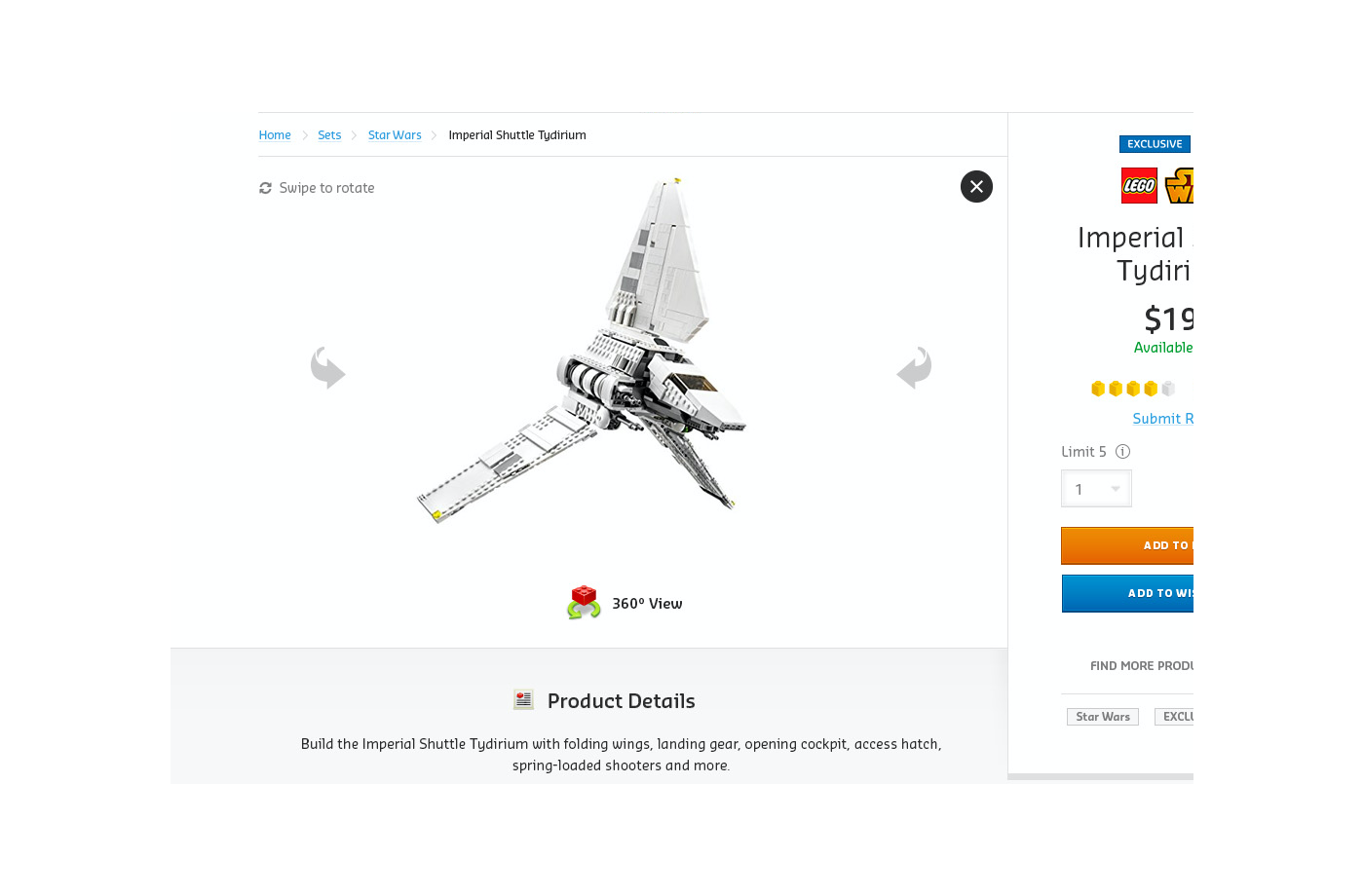
Final Design
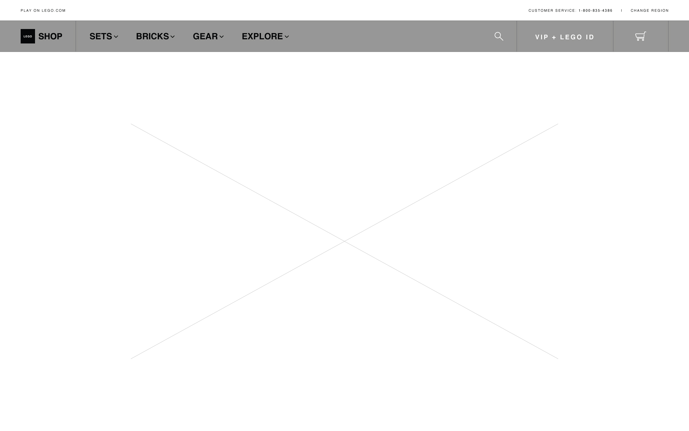
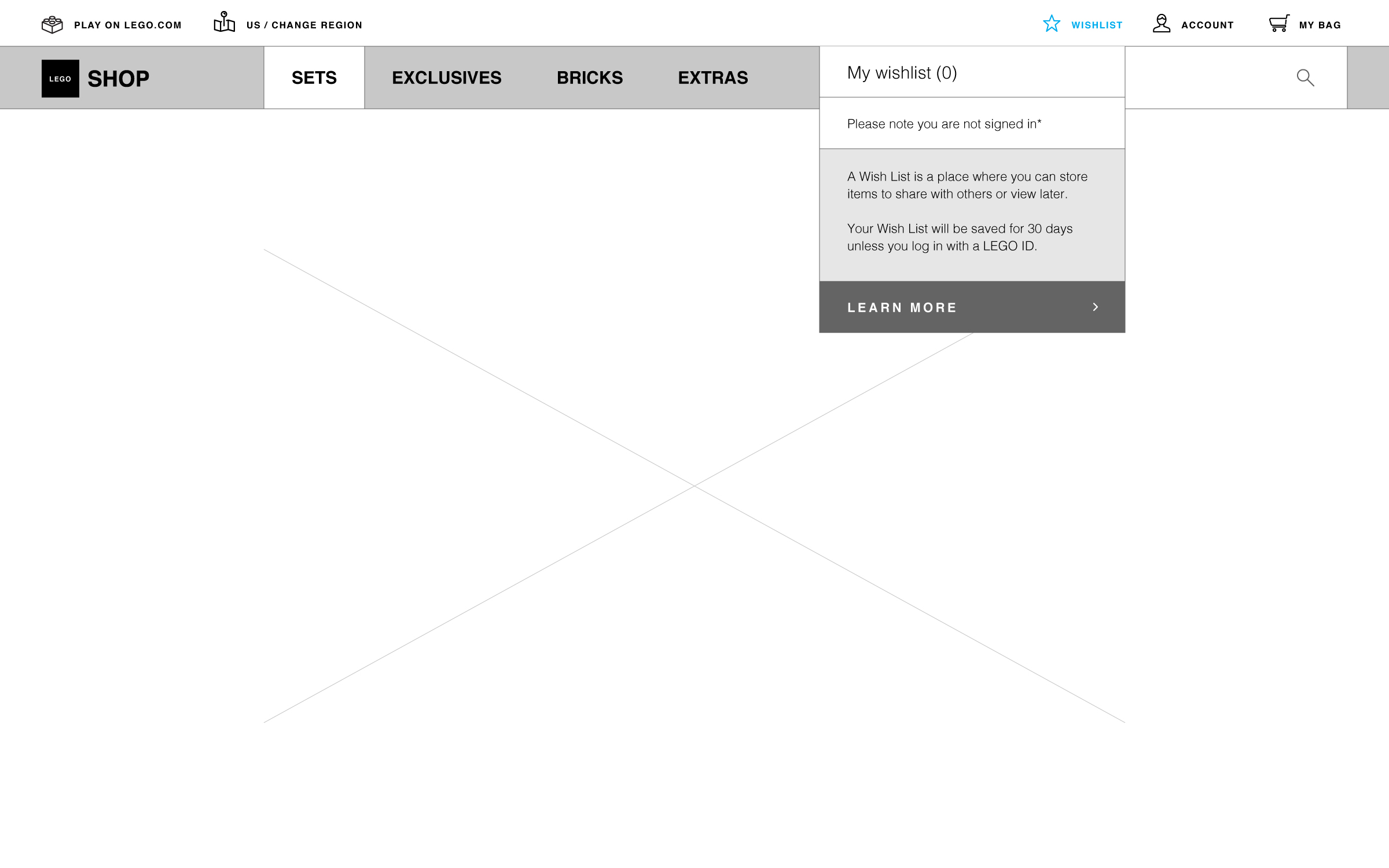
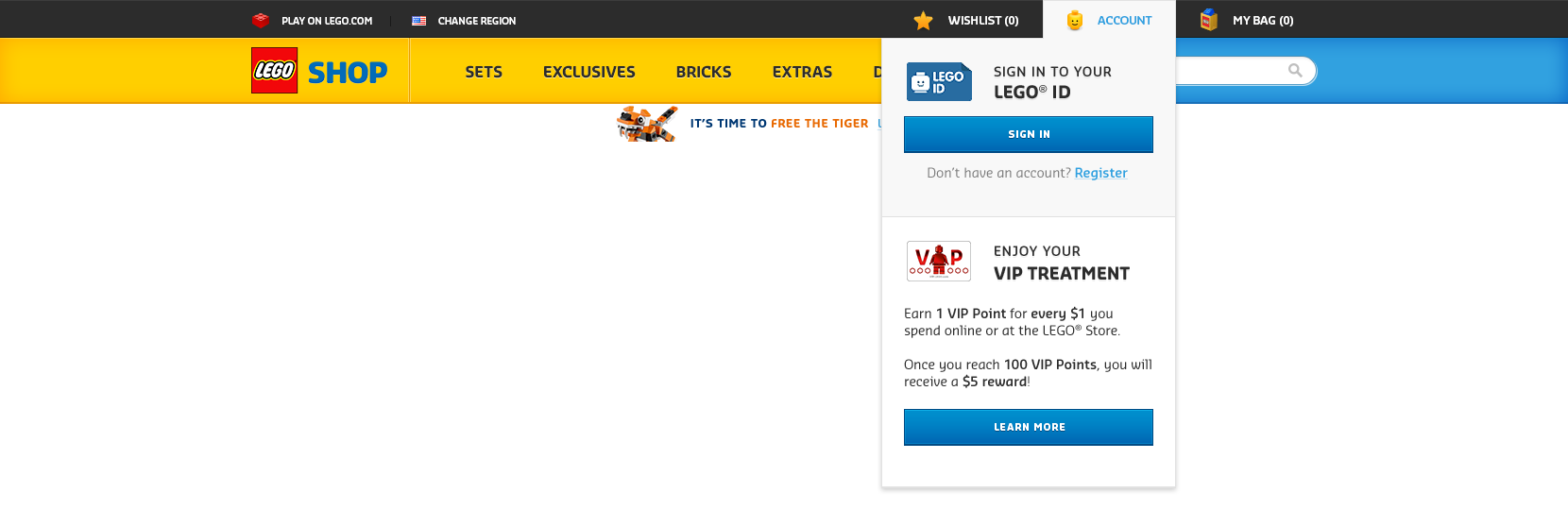
Using the aforementioned 'Store Gone Digital' direction, this is how the final design of the navigation looks like.

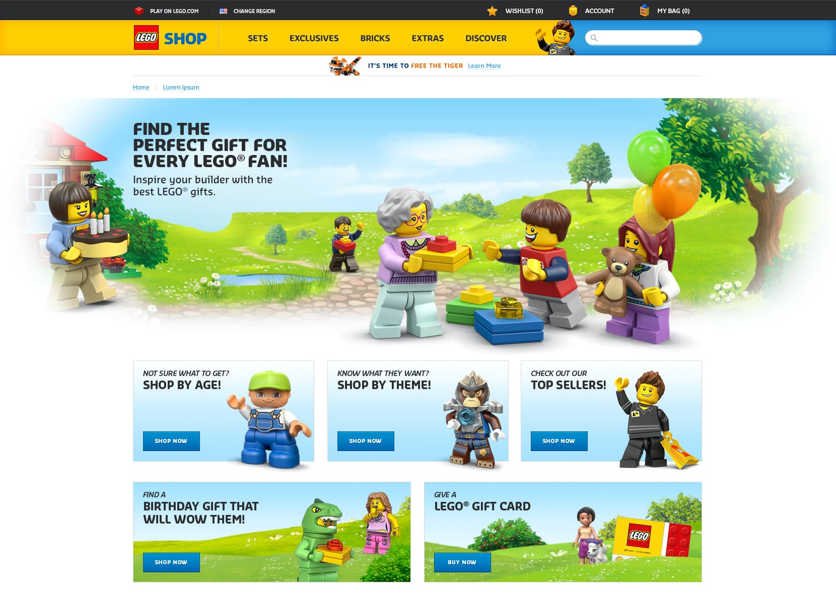
Homepage
The holy grail. The first page everyone sees when they shop for LEGO online. Whether they bounce or go down the funnel to conversion is strongly dependant on the experience of this page.
The Thinking
Convey a clear value proposition
Tell the LEGO brand and product story
Do not throw users into the deep end
Concepts
Using the thinking above, I created many different layouts with varying focus and structure. I initially started with sketches, but eventually moved to paper prototypes to make the process quicker and easier to test down the road.
Some lo-fi wire sketches that were created
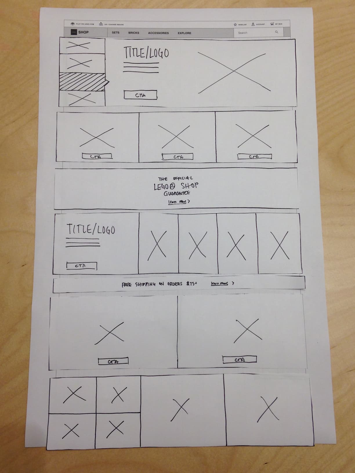
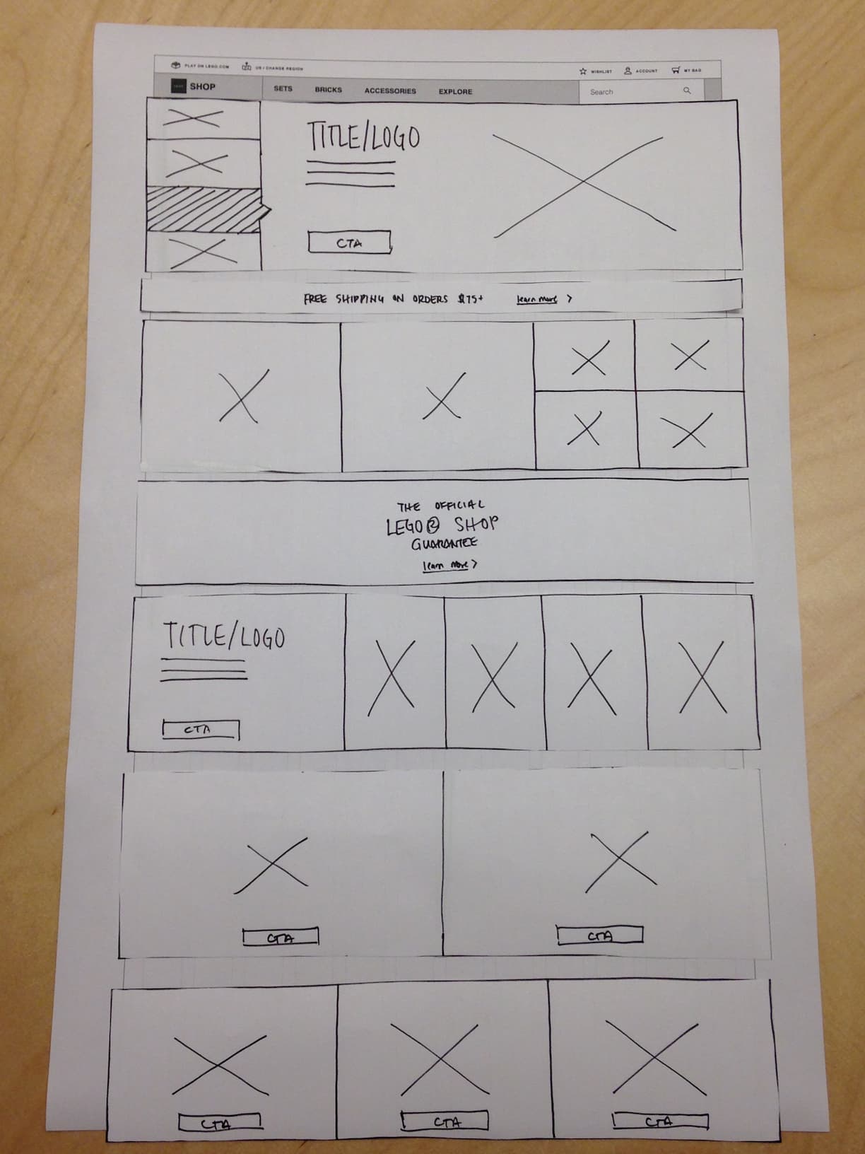
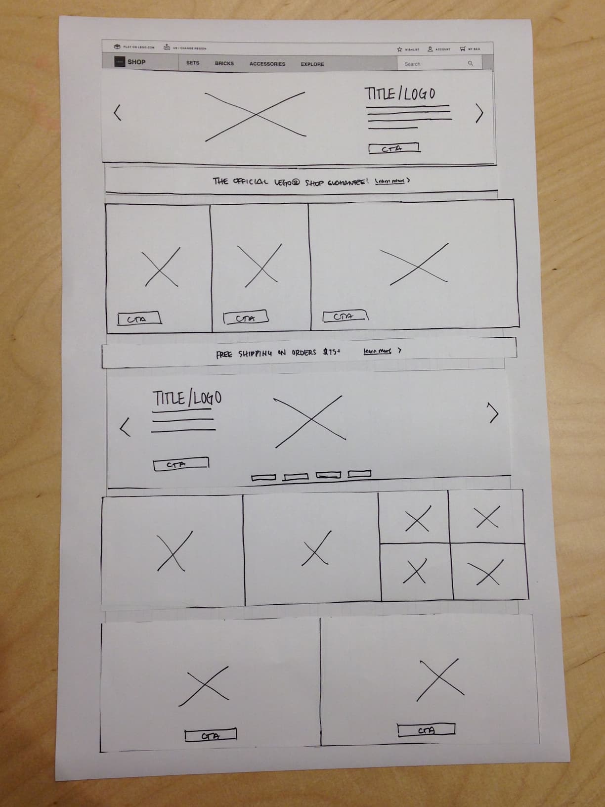
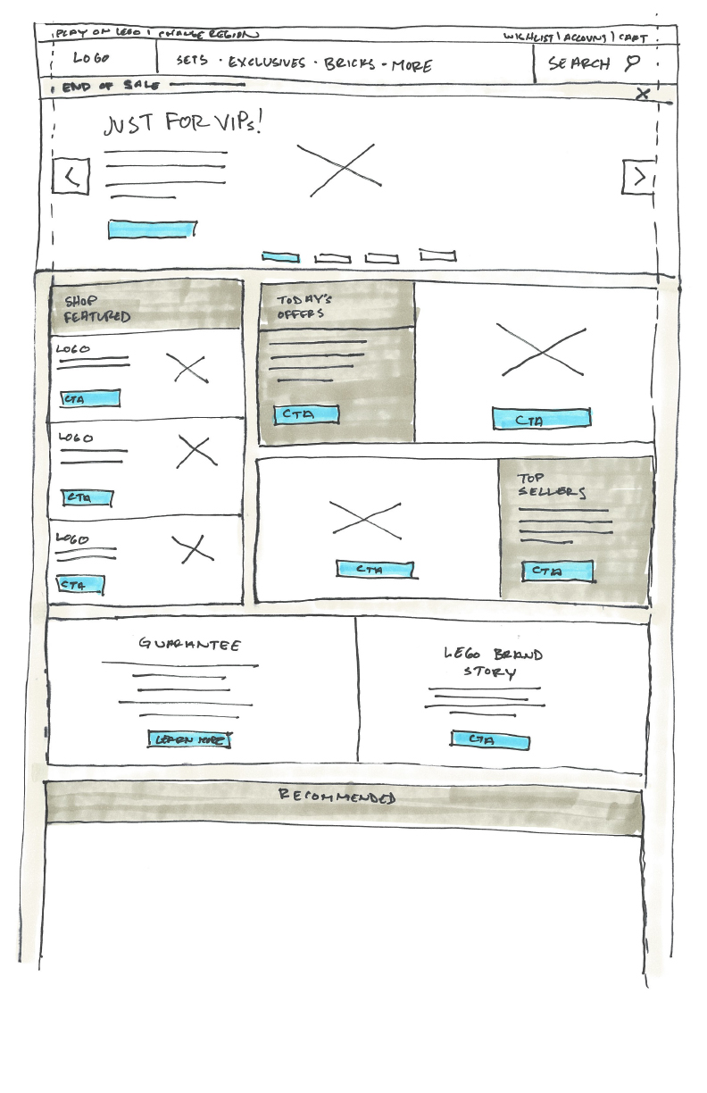
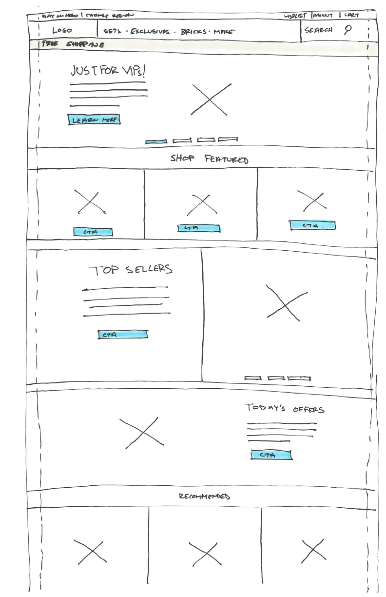
Paper prototypes showing different layout options and module possibilities
Final Wireframe
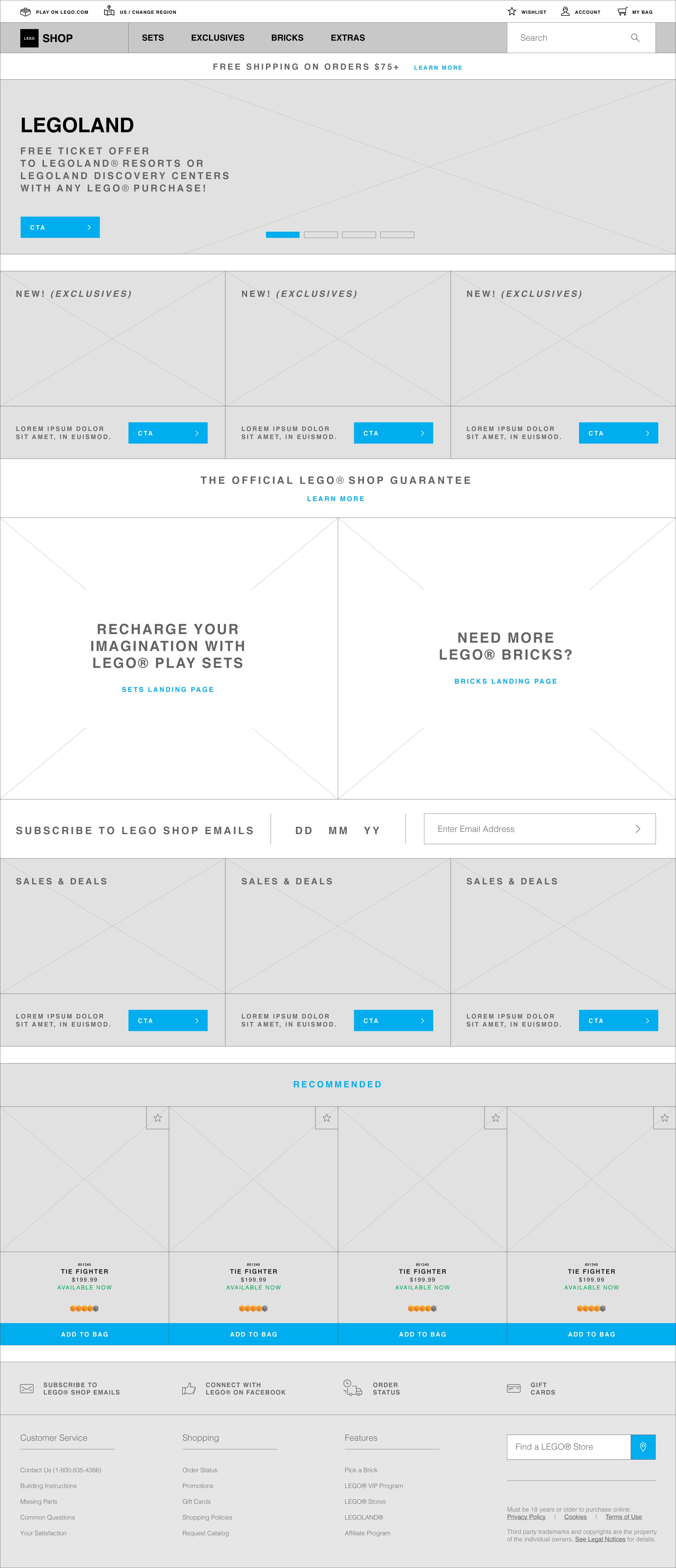
This was the final wireframe version (additional evolution happened within UI)
Applying Store Gone Digital
I wanted to be very deliberate in how I applied the design direction for the homepage. Because LEGO retail stores are designed and constructed with very specific techniques to entice people to stay, play, and browse, I used that as a reference point to finalize my pitch for the homepage layout as well as the visual designs.
Unite the physical and digital store as one cohesive experience
Final Design
Creative Explorations
In addition to the experience and interface redesign, I also came up with some creative ideas.
Some made it to the final build and some inspired additional ideas.
Imagery
A picture speaks a thousand words. For a brand that is so intrinsic to imagination like LEGO, the possibilities are endless. I had an opinion that through various methods and techniques (e.g. juxtaposing LEGO pieces), I can effectively create any messaging or story. A story beyond the branded themes and sets, a story that can be told through LEGO bricks.
The approach of the existing shop site was very product and action focused, while storytelling—which is a big part of the LEGO brand—was significantly missing. This created a disconnect between LEGO as a brand and the products it was trying to sell.
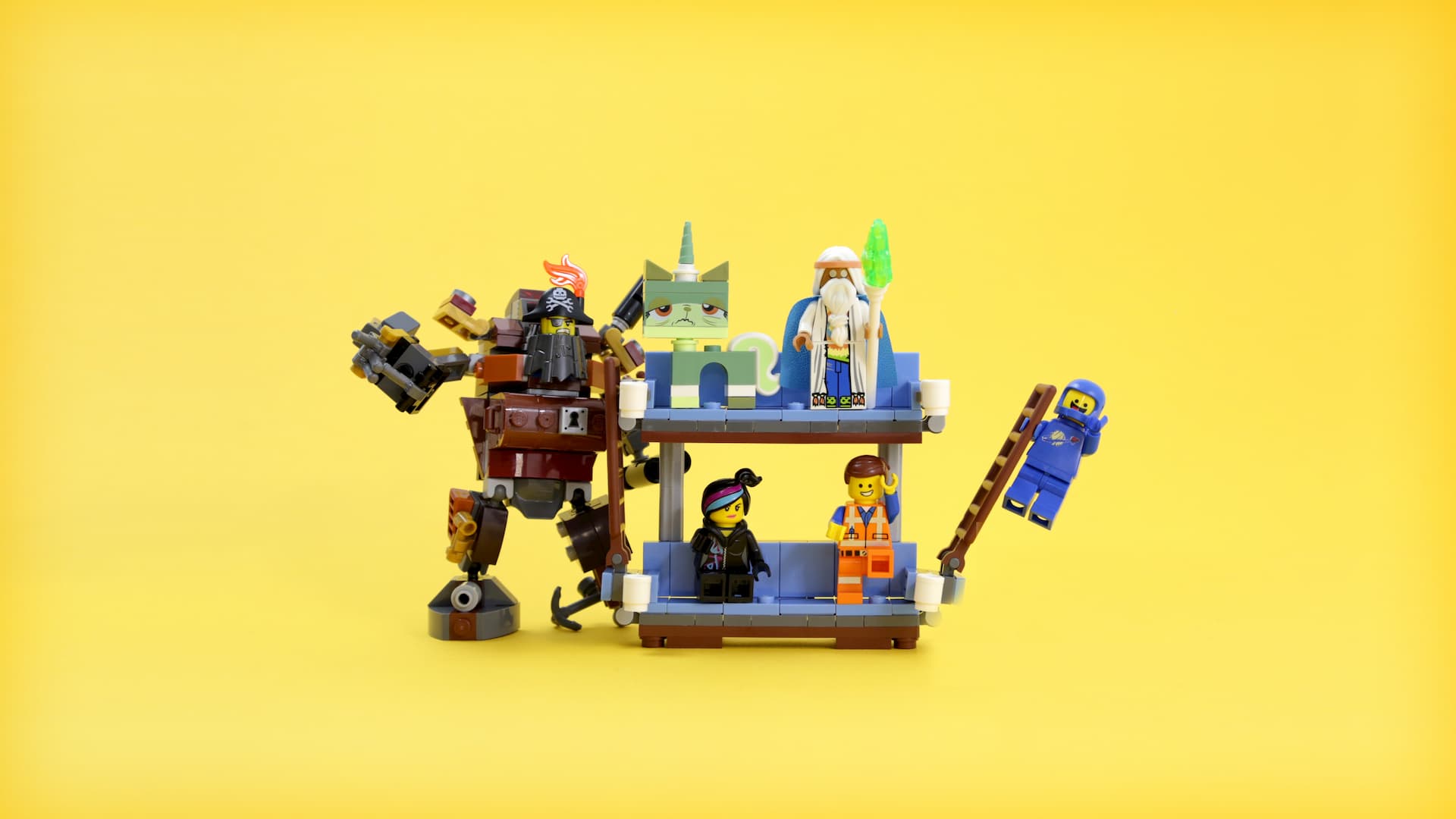
The Inspiration
I was inspired when I stumbled upon some LEGO fan work. Specifically the recreation of some famous movie scenes (examples below).


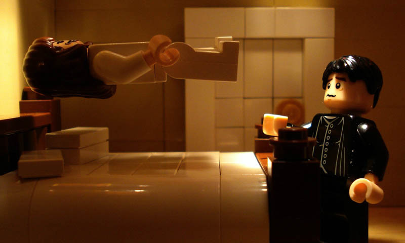
Source: Alex Eylar
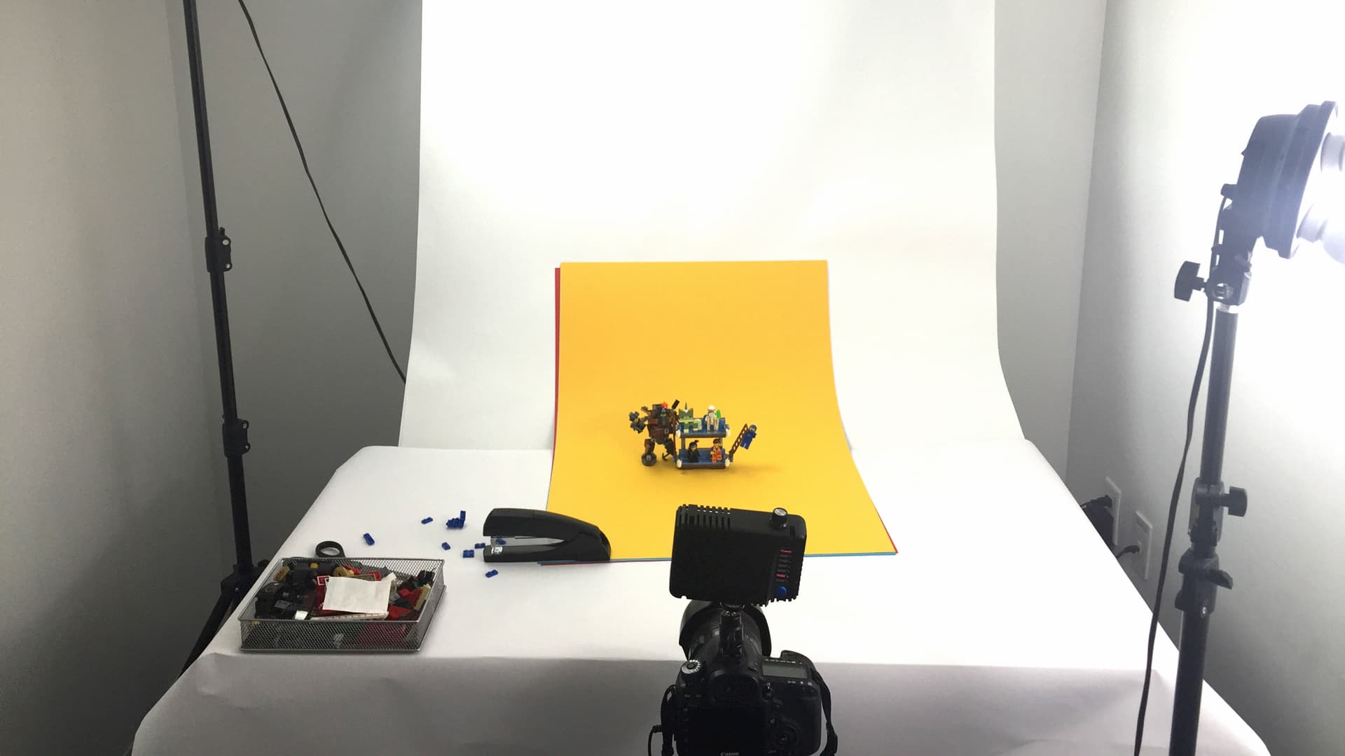
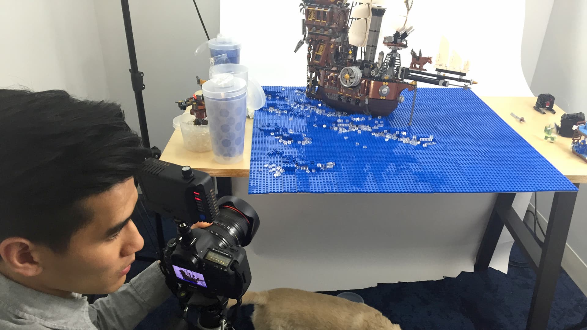
The Test
I grabbed some LEGO pieces, took some shots, and then along with a couple additional examples made a pitch to the LEGO team.
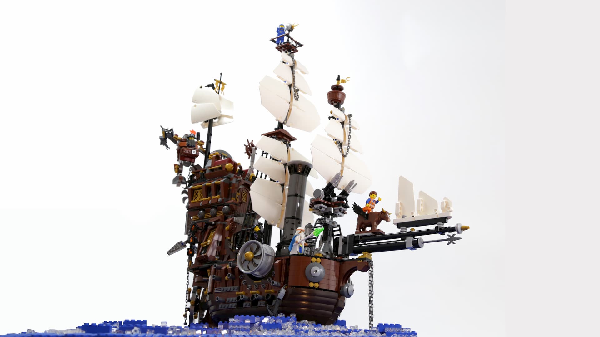
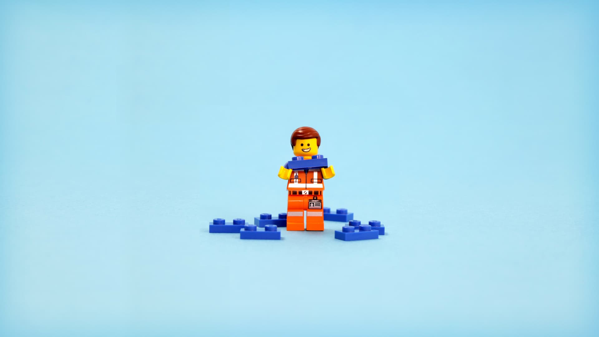
The Result
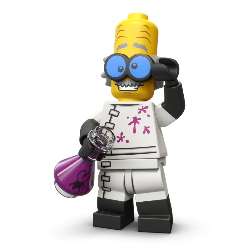
The LEGO team liked the idea, however instead of shooting the images, they decided to utilize 3D assets of their products to build out the vision.
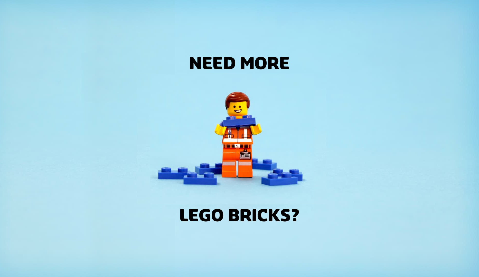
The final creative can be seen being used throughout the website (example below).
Using LEGO pieces to create a party
Conclusion
The redesign was a huge success.
Without divulging exact metrics, I can confirm that all conversion, sales, and engagement have improved significantly. This version of LEGO shop was live from early 2016 to late 2019.
Want to See More?
A lot more work has been put into this including a comprehensive style guide (220 pages), voice guidelines (for copywriting), full mobile responsive designs, localized designs for all regions, and more.
Don't hesitate to reach out if you want to see more